These Are the Best Colors for a Soft Autumn Color Palette
Summary
This article provides a guide for those with a soft autumn color profile on how to choose and style their wardrobe. It emphasizes the importance of selecting warm, muted tones like caramel, beige, and olive that reflect the autumn season. These colors enhance natural beauty, create a sense of harmony, and boost confidence by aligning fashion choices with personal coloring.
Reflection Questions
- Why might understanding your color profile, such as soft autumn, impact your confidence and personal style?
- How could the principles of color analysis be applied to other aspects of personal branding or presentation?
- Considering the overlap with other seasonal color palettes, how might someone determine the most flattering colors for their specific complexion and features?
Journal Prompt
Reflect on your current wardrobe and personal style. Do you see a color theme or palette emerging? How does it align with your natural coloring and the feelings you wish to evoke through your fashion choices? Consider how adopting a more tailored color palette like soft autumn could influence both your style and confidence.
If you’ve recently discovered that you’re a soft autumn through color analysis, this article is for you. Understanding your color palette is crucial for building a capsule wardrobe that flatters your natural tones. As a soft autumn, certain colors will enhance your look more than others. This guide offers practical advice on selecting the right soft autumn colours for your clothes, jewelry, and other accessories. Here, you’ll find straightforward tips and insights on incorporating the warm, muted tones of autumn into your wardrobe, ensuring every outfit complements your coloring. Let’s get started on refining your wardrobe with colors that are just right for you and other soft autumns.
What is a Soft Autumn?
The soft autumn color palette is characterized by warm, muted tones that draw inspiration from the autumn season. Think of the subdued shades of fallen leaves, the gentle gold of late afternoon sun, and the rich, earthy tones of the harvest. These colors are neither too bright nor too dark, embodying a perfect balance of warmth and softness that flatters individuals with this color profile.
Color analysis plays a significant role in fashion and personal style by helping individuals understand which colors best complement their natural features, such as skin tone, eye color, and hair color. For soft autumns, the right colors can enhance natural beauty, create a sense of harmony, and boost confidence. It’s a tool that tailors fashion to the individual, making personal style both unique and flattering.
How to Determine Whether You Are a Soft Autumn
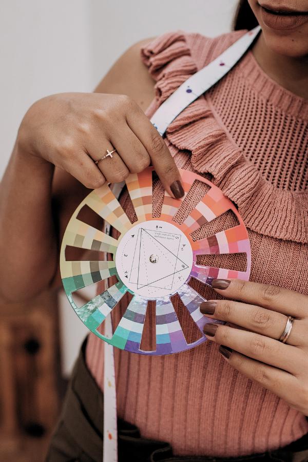
Identifying if you’re a soft autumn involves looking at your natural coloring for key characteristics and skin undertones. Soft autumns typically have a warm, muted quality to their complexion, with eyes and hair that also possess soft, warm undertones. For example, light brown, hazel, and green eyes are typical. Unlike clear or bright color profiles (winter), soft autumns thrive in colors that echo their natural softness and warmth without overpowering it.
Fuel your creative fire & be a part of a supportive community that values how you love to live.
subscribe to our newsletter
*please check your Spam folder for the latest DesignDash Magazine issue immediately after subscription

Several celebrities are believed to exemplify the soft autumn color palette, serving as practical examples of how these colors can be worn effectively. Soft autumn celebrities include Kate Upton, Lucy Boynton, and Emma Stone. These women often come up in discussions about soft autumn due to their warm, muted coloring that aligns with the colour palette. Observing how they incorporate soft autumn colors into their wardrobes can provide real-life inspiration.
Of course, opinions are mixed as to whether these celebrities are soft or deep autumn seasons. Work with a professional and use your best judgement when choosing colors.
Not Sure If You’re a Soft Autumn?
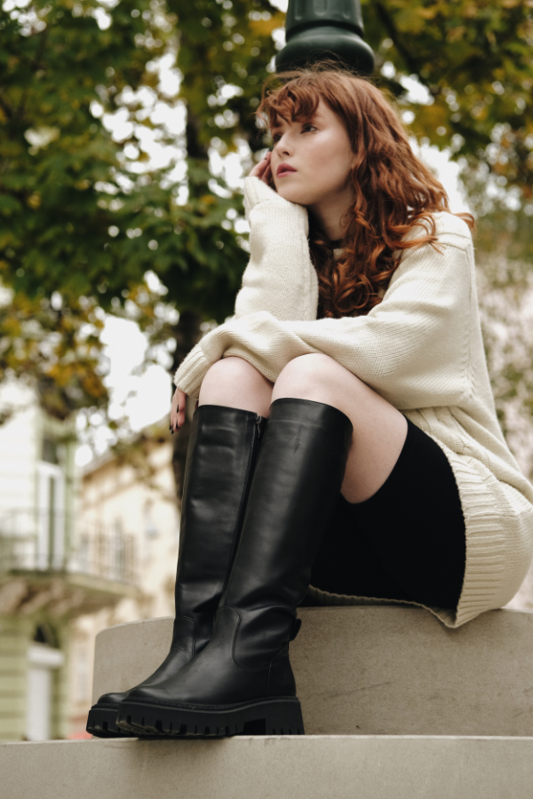
Before undergoing a professional color analysis, individuals with a soft autumn palette might find themselves confused with a few other seasonal color palettes due to overlapping characteristics. The most common confusions occur with the soft summer, true autumn, warm spring, and dark autumn palette.
Soft Summer: Soft summer and soft autumn both share muted tones, but the soft summer palette leans cooler with more emphasis on blues, lavenders, and cool greys. People might confuse the two because of their shared softness and muted quality, but the underlying warmth of soft autumn distinguishes it from the cooler, softer summer hues.
True Autumn: True autumn features warm tones like soft autumn, but its colors are more saturated and rich. Before a color analysis, a soft autumn individual might gravitate towards the true autumn palette, finding some success with the warmth but potentially feeling overwhelmed by the depth and intensity of true autumn’s more vibrant shades.
Warm Spring: Warm spring shares the warm undertone with soft autumn, but its colors are clearer and brighter. The luminosity and vibrancy of warm spring can sometimes appeal to soft autumns, but ultimately, the soft autumn will look best in less saturated and more muted tones than those found in the warm spring palette.
Dark Autumn: The main difference between the soft and dark autumn seasons lies in the depth and saturation of the colors. While both palettes share a warm undertone, dark autumn includes deeper, more saturated hues that can overshadow the natural coloring of someone with a soft autumn profile. Soft autumn colors, by contrast, are lighter and more muted, designed to complement rather than dominate the wearer’s natural coloring.
Identifying the correct palette often requires a nuanced understanding of how different levels of saturation, value, and warmth or coolness can affect an individual’s appearance. A professional color analysis can clarify these distinctions by providing personalized insights, helping individuals navigate the subtle yet significant differences between these seemingly similar palettes.
These Are the Best Colors for Soft Autumn
Rich earth tones are a cornerstone of the soft autumn palette, bringing warmth and depth to any ensemble. Colors like caramel, beige, and olive not only reflect the essence of autumn but also enhance the natural coloring of individuals with a soft autumn profile. Swap blacks with dusty warm dark grey. These shades are versatile and grounding, offering a solid foundation for building a wardrobe that feels both cohesive and seasonally appropriate.
Muted Warm Tones Like Muted Orange, Dusty Rose, and Moss Green

Muted warmth is captured through the soft autumn palette with shades like muted oranges, soft browns, and moss greens. These colors are reminiscent of the changing leaves of autumn, providing a subtle yet vibrant warmth that complements the soft autumn’s natural coloring. Wearing these hues can add a touch of seasonal flair without overwhelming, perfect for those seeking a harmonious blend of color and subtlety in their wardrobe.
For soft autumn individuals, the best shade of pink tends to be a muted, warm pink. Think along the lines of dusty rose, salmon pink, or coral. These shades harmonize with the soft autumn palette’s overall warm and muted quality, adding a touch of color without overwhelming the natural softness of the individual’s coloring. These pinks have a subdued quality, avoiding the brightness or neon tones that can clash with the soft autumn’s natural warmth. Incorporating these shades of pink into your wardrobe can add a gentle, flattering flush of color that complements the earthy, rich tones typical of the soft autumn palette.
Neutrals like Taupe and Warm Gray
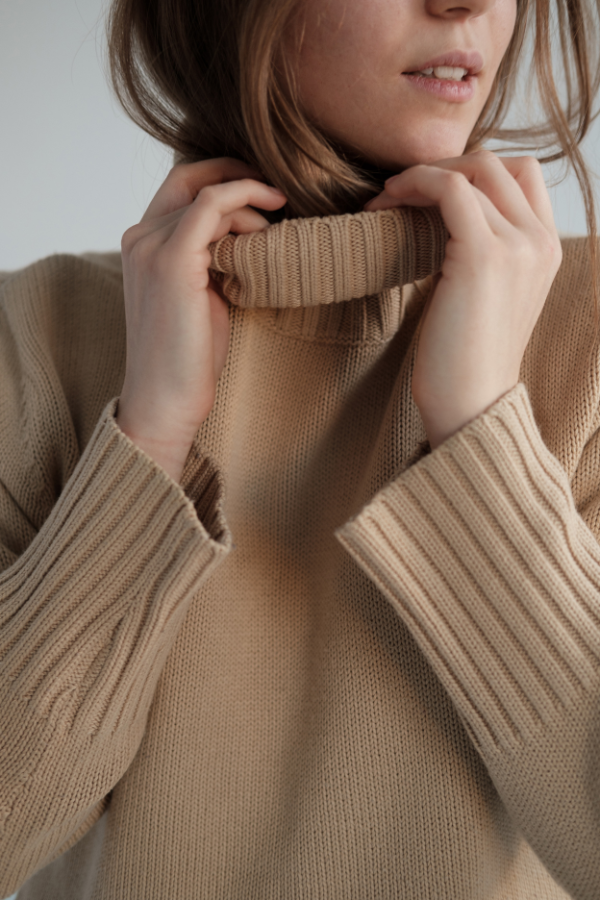
Subtle neutrals play a critical role in the soft autumn palette by offering balance and versatility. Taupe, warm grey, and off-white are key neutral shades that can tie more vibrant colors together or stand alone for a minimalist look. These neutrals are essential for creating outfits that are both sophisticated and effortlessly adaptable, making them invaluable for everyday wear and special occasions alike.
Soft Metallics Like Yellow Gold and Bronze

Instead of bright and shiny metals, soft metallics like bronze and soft yellow gold introduce a touch of elegance to the soft autumn wardrobe, adding a refined sparkle that complements the palette’s warmth. These metallics are not overpowering but offer a gentle luminosity that can elevate an outfit from simple to chic. They also bring out the colors in soft autumn eyes. Incorporating accessories or clothing with these metallic accents can add dimension and interest, showcasing the soft autumn’s natural affinity for warm, subdued elegance.
Incorporating Soft Autumn Colors into Your Wardrobe
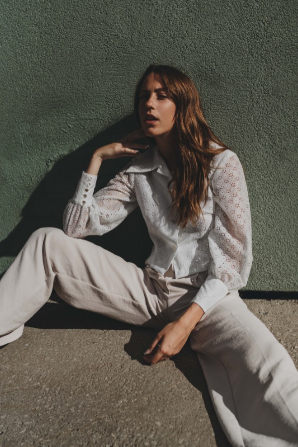
To build a soft autumn wardrobe, start by focusing on key pieces in the palette’s characteristic warm, muted tones. Essentials such as sweaters, jackets, and trousers in shades like olive green, caramel, and dusty rose serve as versatile foundations. Incorporate layered options, like soft, earth-toned blouses or shirts, to add depth. These core items can be mixed and matched to create a variety of looks that stay true to the soft autumn theme.
Mixing and matching soft autumn colors allows for versatility across occasions, from casual to formal. Pair a muted orange top with taupe trousers for a relaxed day out, or a salmon pink dress with a warm grey blazer for office wear. The key is to blend the soft, warm hues in a way that complements your natural coloring, ensuring that no single piece overwhelms the others. This approach maintains a cohesive aesthetic that is both stylish and flattering.
Accessorizing with soft autumn colors involves selecting jewelry, scarves, and bags that enhance the overall look without dominating it. Opt for accessories in soft metallics like bronze and gold to add a subtle sparkle. Scarves in rich earth tones or with understated patterns can tie an outfit together, while bags in muted shades like olive or warm beige add functionality and style. These accessories are the finishing touches that can elevate your soft autumn wardrobe, making each outfit appear thoughtfully curated and uniquely yours.
Soft Autumn Colors in Makeup and Hair
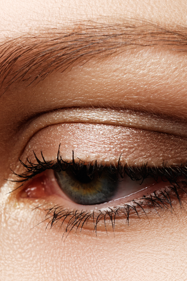
For soft autumn individuals, selecting makeup that complements their natural coloring is key. Eyeshadows should lean towards warm earth tones, such as medium golden brown, muted golds, and subtle greens, enhancing the eyes without overwhelming them with dark colours. Lipstick shades that work best include muted roses, warm peachy nudes, and soft corals, offering a natural yet polished look. Blushes in peach, apricot, or a soft bronze can add a healthy warmth to the cheeks, mirroring the natural flush of a soft autumn complexion. The overall aim with makeup is to enhance and harmonize, not to contrast sharply with your natural coloring.
When it comes to hair, soft autumn individuals flourish with colors that echo their warm and muted natural palette. Ideal hair colors range from rich golden browns and warm auburns to softer caramel highlights. These shades enhance the warm undertones of the skin without creating a harsh contrast, promoting a natural, cohesive appearance. Highlights should be subtle and warm, like honey or amber, woven gently into the base color to add dimension without veering into overly bright or cool-toned territories. The goal is to complement and enrich the soft autumn’s natural coloring, ensuring hair and skin look as though they are in perfect harmony.
Final Thoughts
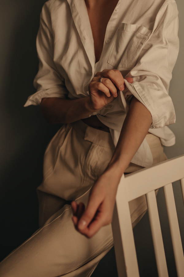
Embracing the soft autumn color palette in your wardrobe, makeup, and hair can transform not only your appearance but also how you feel about yourself. By choosing colors that harmonize with your natural coloring, you create a cohesive and flattering look that highlights your best features. Whether it’s through the clothes you select, the makeup shades you apply, or the hair color you choose, aligning with the soft autumn palette ensures that you present the most authentic and beautiful version of yourself to the world.
With all that said, remember that the most important thing is to enjoy how you look and feel. Wear what you love!
Design Dash
Join us in designing a life you love.
Women, In Their Own Words: Jamie Young
LIKE 4 LEAVE COMMENT 0 5 min read SummaryJamie Young, Founder and Creative Director of Jamie Young Co., shares her journey of balancing artistry and entrepreneurship over nearly 30 years in the design industry. She discusses finding inspiration in unexpected places, evolving her creative process, and the challenges women face in the business world. Jamie…
How to Set Financial Goals for Your Interior Design Business
From prioritizing the Big Financial Four to making each goal SMART, here’s how to set and track actionable financial goals for your interior design firm.
Should You Work with a Business Coach or Financial Advisor?
The decision to work with a business coach, financial advisor, or both will come down to your individual circumstances and priorities. Read on to learn more!
Turning Setbacks into Opportunities: Transform Challenges into Success
LIKE 0 LEAVE COMMENT 0 10 min read Summary Reflection Questions Journal Prompt Setbacks — those unexpected roadblocks that appear just when we think we’ve got everything figured out. Whether it’s a project gone awry at work or a personal goal taking an unexpected turn, we’ve all experienced them. But what if these setbacks could…
Raising Resilient Children: Building Confidence, Strength, and Adaptability
LIKE 0 LEAVE COMMENT 0 11 min read Summary Reflection Questions Journal Prompt Your child comes home from school, slumps onto the couch, and declares they’re never going back because someone made fun of their new haircut. As a parent, your heart breaks a little. But these moments are opportunities to help your child develop…
A Guide to Setting Personal Goals in Midlife
LIKE 0 LEAVE COMMENT 0 8 min read Summary Reflection Questions Journal Prompt Midlife is often portrayed as a stage where we’re supposed to have everything figured out. However, the reality is that most of us are still navigating life’s complexities, and that’s perfectly fine. In fact, this period can be an ideal time for…


