Why Interior Designers Should Consider an Online Color Theory Class
Summary
Online color theory classes offer designers a flexible way to deepen their understanding of color, enhance their projects, and communicate ideas more effectively. The article highlights the benefits of these classes, such as improved design skills, access to expert insights, and the ability to work at your own pace, making them a valuable resource for creative professionals.
Reflection Questions
- How confident are you in your ability to use color effectively in your current design work?
- What aspects of color theory do you feel would most improve your projects or creative process?
- How might an online color theory class fit into your professional development goals this year?
Journal Prompt
Imagine how a stronger grasp of color theory could transform your design projects. Write about a recent project where you struggled with color decisions and how advanced knowledge might have influenced your choices. What benefits do you envision for your future work after taking an online color theory class?
Color theory is foundational for interior designers—and every other creative. It offers insights into the science and emotion of color combinations we select for interiors, advertisements, paintings, and so much more. Understanding color theory empowers us to blend technical knowledge with intuitive feeling to create compelling compositions and convey powerful messages.
From the historical teachings of Itten and Albers to the contemporary applications in digital and physical mediums, color theory ensures we craft harmonious, impactful designs that evoke the desired emotions. Read on to learn more about this discipline and for a short list of our favorite online color theory classes to get you started.
What is Color Theory?
Color theory isn’t just about picking pretty hues for your next project. As you probably already know, understanding color theory is key to creating spaces that feel intentional and visually stunning. At its core, color theory is a framework for understanding how colors work together (or don’t) and the emotional and visual effects they create.
You’ve probably heard of the color wheel, but there’s way more to it than warm vs. cool colors or primary vs. tertiary hues. Color theory dives into the nitty-gritty of hues (pure colors), saturation (how bold or muted a color is), and value (how light or dark it appears). It’s the secret sauce behind picking palettes that aren’t just pretty but purposeful.
For interior designers, mastering color theory can elevate your work from good to unforgettable. Of course, we’re not just talking about paint or fabric swatches—it’s about how shades, tints, textures, and even patterns play off each other to tell a cohesive story in a space. Whether you’re designing a cozy living room, a bold office, or a serene retreat, understanding these principles helps you create spaces that resonate deeply with clients.
If you haven’t taken a color theory course (or at least skimmed the basics), consider it your next professional development step. It’s one of those tools that’s invaluable in the design world—right up there with mood boards and CAD software.
Ready to take your designs to the next level? Let’s talk color!
What’s the Difference Between Color Theory and Psychology?

Compared to color theory, color psychology is more about understanding how colors make people feel.
For instance, blue often brings a sense of calm and trust (hello, spa vibes), while red can spark passion or urgency (perfect for that statement wall in a bold dining room). Every color has the potential to evoke a mood, shift perceptions, or create an atmosphere that resonates deeply with the people using the space.
As an interior designer, you’re already thinking about balance, texture, and flow. But layering in color psychology? That’s how you create spaces that speak to your clients’ emotions and needs. Whether it’s energizing a workspace, soothing a bedroom, or making a living room feel welcoming, the emotional impact of color is a game changer.
Think of it this way: color theory helps you nail the technical stuff—what pairs well, how to mix and match. But color psychology takes it a step further, diving into the emotional and psychological why behind your palette choices.
Examining Different Schools of Thought Within Color Theory
Color theory isn’t a one-size-fits-all concept. Over time, different schools of thought have emerged, offering unique perspectives on how color works and how we perceive it. Let’s dive into a few key theories that have shaped modern design—and can inspire your work today.
Johannes Itten’s Theory: Harmony Meets Emotion
Johannes Itten, a Swiss color theorist and artist, is a must-know name in art and design education. His theory emphasizes the interplay of color contrasts and harmony, but what sets Itten apart is his focus on how colors evoke subjective feelings. He bridged the gap between the emotional and objective aspects of color, giving designers tools to create both balanced and deeply resonant palettes.
Josef Albers: The Relativity of Color
Josef Albers took color theory in a different direction, exploring how context changes how we perceive color. His groundbreaking experiments demonstrated that a single hue can look entirely different depending on the colors surrounding it. Albers’ insights are a must for designers working with layered palettes or creating spaces where lighting and textures might shift color perception.
The Bauhaus: A Multidisciplinary Approach to Color
Both Itten and Albers taught at the Bauhaus, a movement that wove science, art, and technology into its design philosophy. Bauhaus thinkers emphasized functionalism, form, and the psychological impact of color, making it a cornerstone of modern design education. Their integrated approach inspires designers to think beyond aesthetics and consider how color interacts with space, light, and purpose.
These theories show just how complex and dynamic color can be. Whether you’re diving into Itten’s contrasts, experimenting with Albers’ color interactions, or channeling the Bauhaus ethos, these frameworks provide a rich foundation for pushing your designs further.
The takeaway? Color isn’t just a tool; it’s a language—and understanding its nuances can elevate your work from good to unforgettable. Learn more about how different artistic disciplines use color theory in their practices here.
How Does Understanding Color Theory Benefit Artists and Designers?
Understanding Color Relationships

Creating visually stunning and harmonious designs starts with understanding the relationships between colors. At the heart of this is the color wheel—a classic tool that breaks down how colors interact and helps designers build cohesive palettes. Knowing these relationships is majorly important whether you’re aiming for contrast, balance, or harmony. Let’s review the basics before moving forward.
- Complementary colors (opposites on the wheel) create vibrant, high-energy combinations.
- Analogous colors (neighbors on the wheel) offer a soothing, unified look.
- Triadic colors (evenly spaced around the wheel) strike a balance between contrast and harmony.
These frameworks help direct attention and shape the mood of your designs.
Take it a step further: understanding color relationships lets you manipulate spatial perceptions and visual hierarchy. Complementary colors can make designs pop, while analogous colors create a serene, cohesive vibe. Want to guide a viewer’s eye or evoke a particular emotion? Your palette can do the heavy lifting.
In professional design work, this level of control can set you apart. Whether you’re crafting interiors, designing a logo, or creating a visual campaign, strategic color use can elevate your work—reinforcing brand values, enhancing readability, and making your designs unforgettable.
Enhancing Emotional Impact
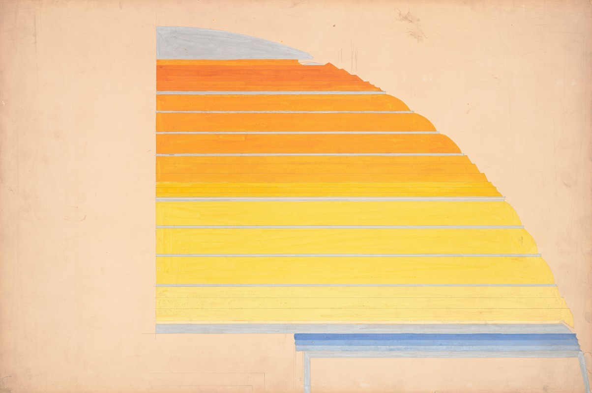
Colors have a profound ability to evoke emotions and influence perceptions, making color psychology an essential tool for designers. Think about it: blues can create a sense of calm and trust, reds spark energy and urgency, and yellows radiate happiness and creativity. By understanding these associations, you can use color strategically to guide how people feel about your work.
This isn’t just theory—it’s practice. Whether it’s boosting engagement with a website’s call-to-action button or creating a particular atmosphere in a space, the emotional impact of color can make all the difference. A well-chosen palette doesn’t just look good—it feels right, shaping the viewer’s experience in subtle but powerful ways.
Fuel your creative fire & be a part of a supportive community that values how you love to live.
subscribe to our newsletter
*please check your Spam folder for the latest DesignDash Magazine issue immediately after subscription

Improving Visual Communication
Through color theory, you learn how to create hierarchy, direct attention, and guide your audience through a visual experience. For example:
- A bold pop of color can draw the eye to a call-to-action.
- Adjusting contrast and brightness can emphasize key information.
- Strategic saturation can create focal points or enhance usability.
From branding and marketing to fine art and UX design, understanding how color affects interpretation is so vital. The right palette can make a brand identity more memorable, improve user experience, or convey the mood of a painting with precision.
By mastering the emotional and communicative power of color, you’re not just designing—you’re creating experiences that resonate. And that’s what great design is all about.
Increasing Design Cohesiveness

Ever noticed how a well-planned color palette can make a space feel just right? That’s the magic of color theory at work, helping us develop cohesive designs where every element feels connected. For interior designers, mastering this can elevate your projects from good to unforgettable.
Why Cohesiveness Matters
Cohesiveness isn’t a buzzword (though you probably hear it everywhere). It’s essential for creating spaces that resonate. In branding, consistent colors strengthen recognition. In interior design, they contribute to a harmonious aesthetic that makes clients feel at home. By understanding how to select and combine colors based on the color wheel, cultural significance, and psychological impact, you ensure every part of your design works together seamlessly.
Consistency is Key Across All Platforms
Keeping color usage consistent across different mediums amplifies your design’s impact. Think of a company’s logo colors flowing effortlessly into their website, marketing materials, and even their office interiors. This seamless experience builds a strong, recognizable brand identity. For us interior designers, it’s about creating that same flow within a space, ensuring everything from wall colors to accent pieces tells a cohesive story.
Mastering Color Harmony, Balance, and Contrast
Learning about color harmony, balance, and contrast isn’t just academic—it’s practical. These principles help you craft designs that are visually pleasing and communicate your client’s values. It’s about appealing to the target audience on a deeper level. So whether you’re aiming for a calm, minimalist vibe or a bold, energetic atmosphere, understanding these concepts is your toolkit for success.
Facilitating Problem Solving
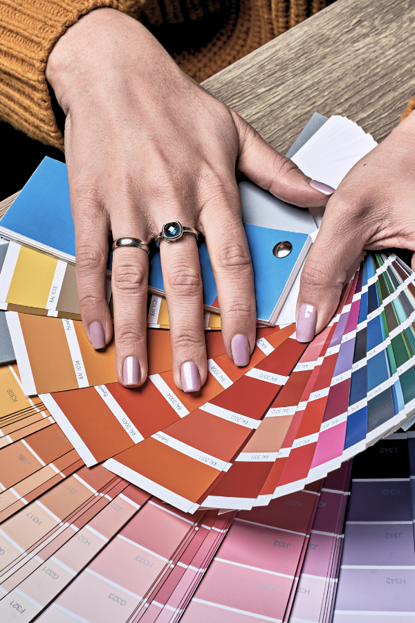
Whether you’re struggling with visual emphasis, poor user engagement, or a composition that just feels off, a solid grasp of color principles can guide you toward creative solutions. For instance, tweaking a color scheme can shift the mood, improve readability, or restore balance to a design.
Even better, understanding color theory helps you justify your decisions. When clients or collaborators ask, “Why this color?”, you’ll have the rationale to back it up. This not only makes feedback sessions more productive but also fosters clearer objectives and smoother teamwork, resulting in better designs all around.
Expanding Creativity
Color theory helps with creative growth by encouraging experimentation beyond instinctual choices. It empowers you to explore unconventional palettes, challenge traditional schemes, and develop a signature style that sets your work apart. By understanding how colors interact and the emotions they evoke, you’ll unlock new possibilities for expression and innovation.
Ever considered pairing colors that shouldn’t “work” together? Dive into color theory, and you might just discover groundbreaking combinations that transform your designs. This kind of exploration is what fuels artistic growth. It helps you refine your voice and stay ahead in fast-moving creative fields.
Adapting to Different Mediums

Colors don’t behave the same way everywhere, and knowing how they change across mediums is key. What looks vibrant on a screen might fall flat in print—or shift entirely on fabric. Color theory classes tackle these nuances, equipping you to adjust and adapt your choices for any medium.
This adaptability is essential in today’s multidisciplinary projects. For example, branding often spans digital platforms, printed materials, and physical products. Mastering color management ensures your vision translates seamlessly, no matter where it appears.
Enhancing Professional Competency
In many creative fields, a solid grasp of color theory is a mark of professional competency. It signals a designer’s or artist’s ability to make informed, intentional choices about color, contributing to the effectiveness and aesthetic quality of their work. Whether you’re crafting a logo, designing a space, or creating art, proficiency in color theory signals a level of expertise that sets you apart.
It also improves collaboration. Clear communication about your choices leads to better teamwork, smoother presentations, and stronger outcomes. You’re not just creating beautiful things—you’re crafting solutions that work.
Cross-disciplinary Relevance

The principles of color theory extend far beyond traditional design fields. They’re just as relevant in digital media, fashion, advertising, architecture, and more. Whether you’re enhancing a user’s digital experience or defining a brand’s identity, understanding color’s role is invaluable.
This versatility fosters collaboration across disciplines. Architects, marketers, and UX designers all speak the same “language” when they understand color theory, creating opportunities for innovation and cohesion in projects that span multiple fields.
Cultivating Aesthetic Sensitivity
The more you engage with color theory, the more your sensitivity to subtle color nuances grows. This heightened awareness allows you to make more refined, impactful choices, whether you’re balancing hues, tweaking saturation, or experimenting with brightness.
Over time, this sensitivity becomes your edge. It’s what transforms good designs into unforgettable ones and allows you to push boundaries, develop unique styles, and set trends.
Online Color Theory Classes for Artists and Designers
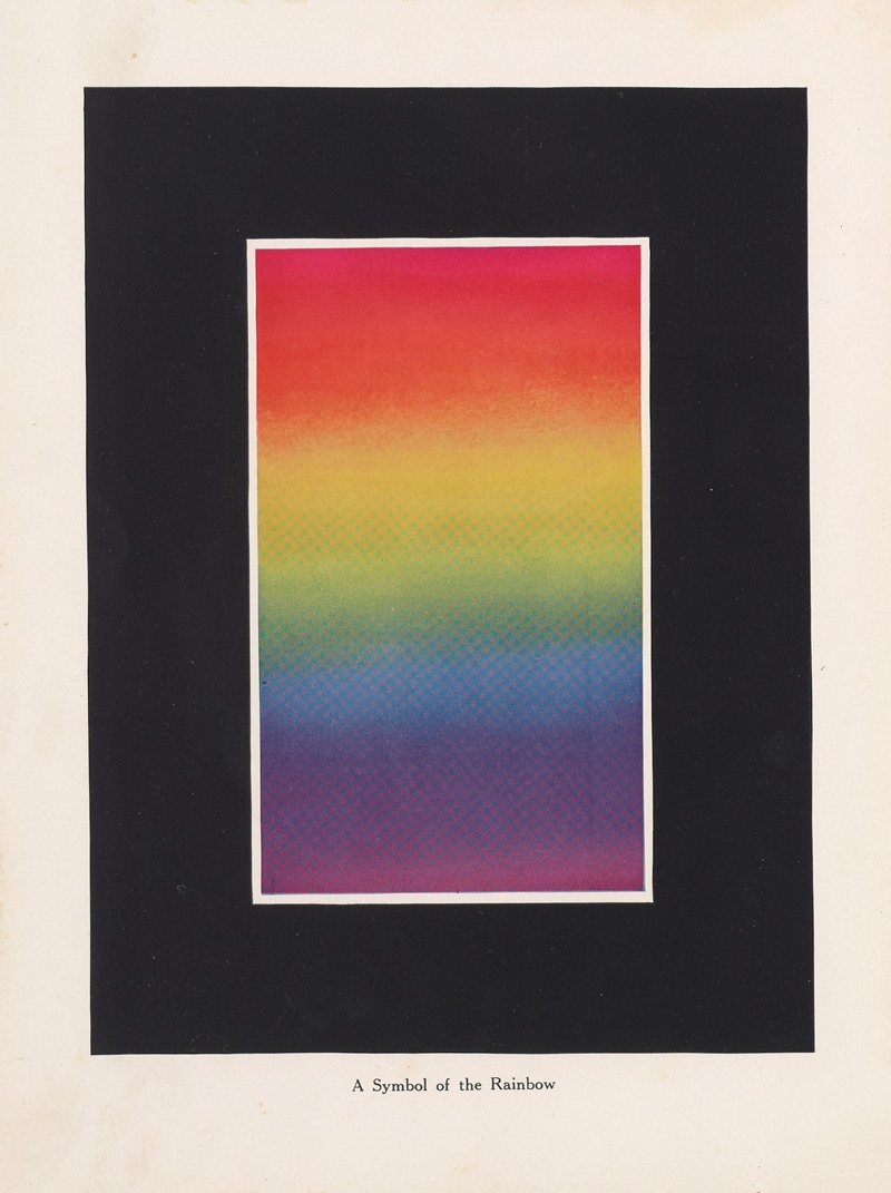
While taking a color theory class in person can be more impactful for certain creative professionals, an online class can offer basic foundational education. For artists and designers looking to deepen their understanding of color theory through online courses, several highly regarded options are available that cater to different aspects of color application, theory, and psychology. Let’s take a look.
Color Theory: Exploration & Application by Richard Mehl on Domestika

This course focuses on applying color theory in graphic design and explores the principles developed by renowned artists like Johannes Itten and Josef Albers. This course is led by Richard Mehl, an experienced designer and educator who brings a comprehensive approach to teaching color theory, incorporating both practice and theory, including poster design, type styles, composition, and animation.
Color Theory from the University of Colorado Boulder
This course, featured on a list of the best color theory courses, covers design elements, uses of color, and graphic file formats. It starts with the basics of the color wheel and progresses to how colors are used in various mediums, including print and electronic media. By the end of the course, students will understand how to select between CMYK, Pantone, and RGB color options and will have a chance to design a web or sponsorship advertisement.
CreativeLive’s “Illusion of Transparency from Color Theory for Designers: Exploration and Application”
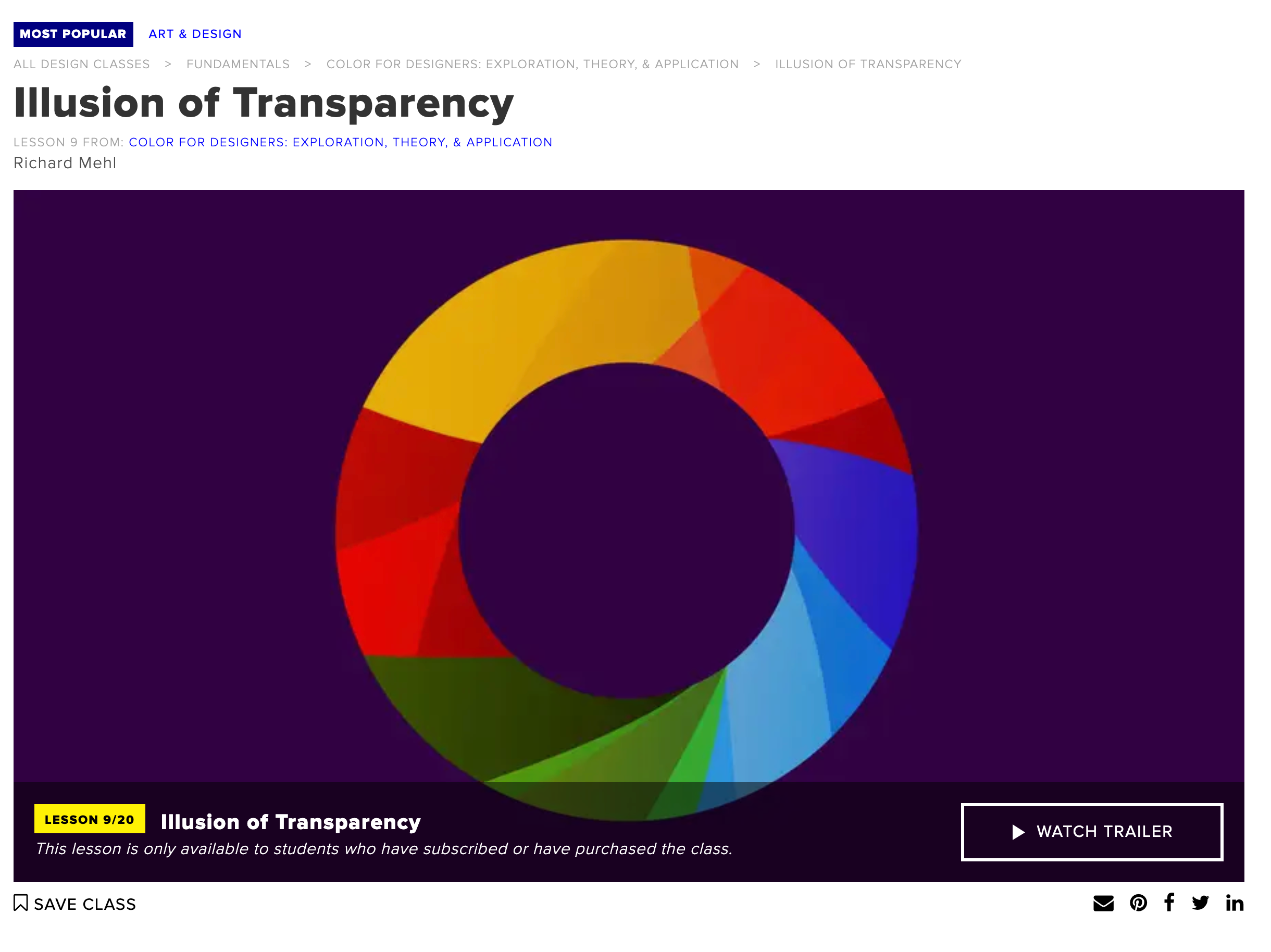
This course includes a series of hands-on lessons that explore how colors interact to create illusions of transparency, a concept pioneered by Josef Albers. It encourages practical experimentation and provides a deeper understanding of color relationships and how they can be applied to design.
Leatrice Eiseman’s Online Color Training Courses
These classes offer in-depth training in color theory, including self-check quizzes and interactive Q&A sessions with Eiseman herself. They cover various topics, including the Color and Design Master Course and Colortime® Image Online Training, which focus on practical applications of color theory in fields like wedding services and interior design. Eiseman’s courses are renowned for their comprehensive approach to color theory, combining psychological insights with practical applications.
Ready to Start?
Let us know if you take one of these courses in the comments below!


