Styling Spaces Seasonally for Evergreen Portfolio Content + Of-the-Moment Marketing

 9
9
Summary
Seasonal styling doesn’t require redoing a space. Rather, it’s about subtle shifts. By planning for swap-able accents, varied botanicals, flexible drapery, thoughtful compositions, natural light, and restrained editing, designers can generate year-round portfolio imagery and seasonal marketing content from a single photoshoot without compromising brand consistency.
Reflection Questions
How often do you plan photoshoots with future seasonal marketing in mind, rather than capturing only a single “final” version of a space?
Which styling elements in your projects (textiles, botanicals, lighting, or props) offer the most flexibility for subtle seasonal shifts?
Does your portfolio reflect a consistent visual identity across seasons, or do seasonal changes sometimes dilute your brand’s point of view?
Journal Prompt
Think about a recent or upcoming photoshoot. How could you capture that space in multiple seasonal moods through styling swaps, framing, lighting, or edits, without changing the design itself? Write out a simple shot plan that would allow you to release imagery steadily over the next year while maintaining a cohesive, evergreen portfolio.
As with every year, this season’s High Point Market was drenched in the colors of fall: orange, navy, merlot, ochre, sienna, beige, black, charcoal… Those moody, organic colors and saturated jewel tones filled nearly every showroom. Reflecting on the difference between fall and spring markets encouraged us to consider how designers stage spaces during portfolio-focused photoshoots so those images can be used both year-round and seasonally.
Perhaps a vignette of a club chair upholstered in a dark floral pattern? The motif is perfect for spring, but the moody color palette works beautifully in fall as well. Simply adjust the drapery behind the chair, and you’ve maximized its marketing potential. Beyond that, how do designers style spaces for photoshoots so they have a plethora of seasonal content for Instagram and evergreen photos worthy of their online portfolio? Let’s discuss.
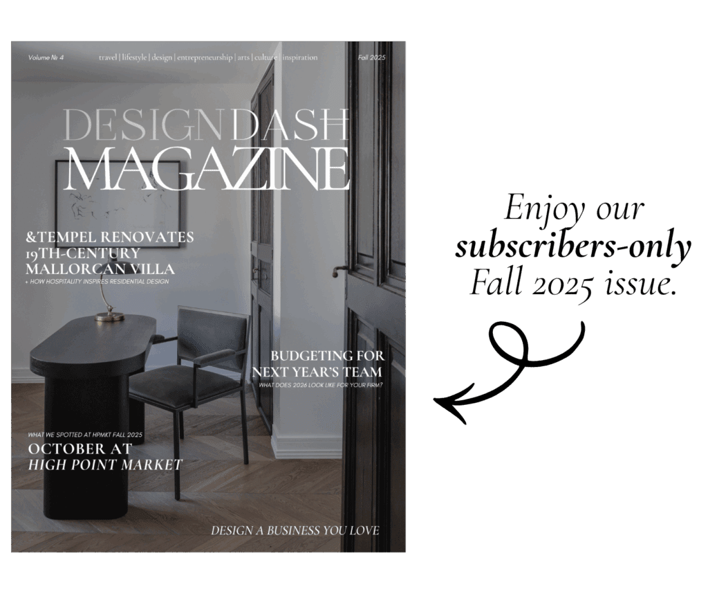
*This article was originally published in the Fall 2025 issue of DesignDash Magazine. Subscribe below to read the full article and associated issue.
How to Style Spaces Seasonally as an Interior Designer
Style Spaces with “Swap-Ability” in Mind
In practice, most finished interiors don’t need dramatic restyling between seasons. Small, deliberate adjustments are often enough. The substitution of one textile, vessel, or book can shift a scene from bright and summery to subdued and moody without undermining the composition. Shooting a few of these variations during the same session creates options for later use and eliminates the need for reshoots. The key here is to identify which accents have the most visual influence and to treat them as movable parts rather than fixed décor.
“In the depth of winter, I finally learned that within me there lay an invincible summer.”
― Albert Camus
The value of “swap-ability” lies in efficiency rather than novelty. Most of the time, the architectural and furnishing decisions have already fixed the character of a space. What remains flexible are the smaller layers like throws, trays, objects, or even the order of books on a surface.
Changing or repositioning these elements empowers the same image to serve multiple purposes. A single photograph might later be cropped, captioned, or contextualized in different ways depending on seasonal needs or marketing direction. You don’t necessarily need to disguise repetition; just recognize that well-composed interiors can be interpreted multiple ways. After all, they are enjoyed and “repurposed” year-round by their inhabitants.
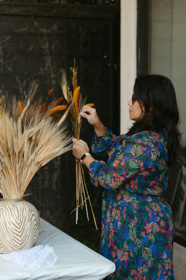
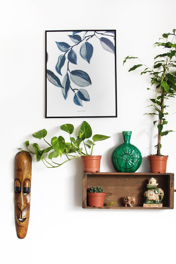
Bring a Variety of Botanicals and Florals
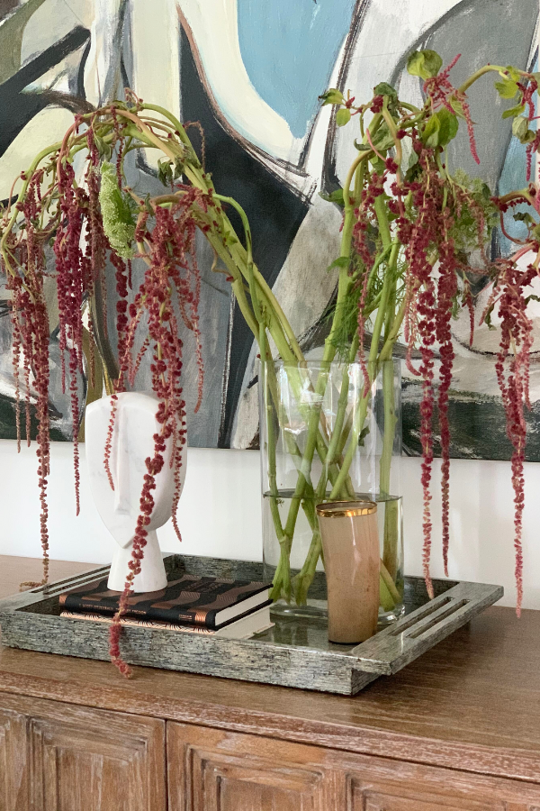
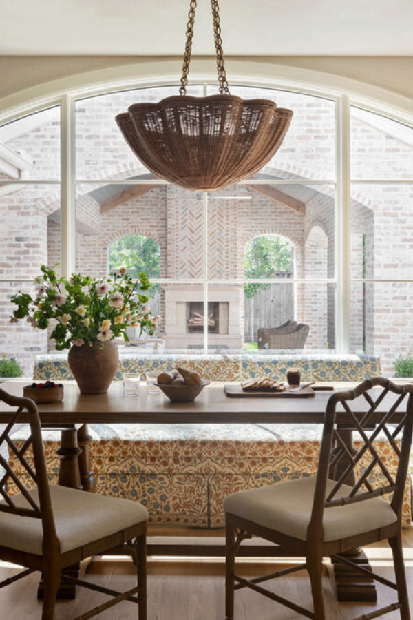
Floral and botanical elements are still the most efficient way to signal a change in season. The presence of greenery, the looseness of an arrangement, or even the decision to use bare branches can communicate the intended time of year. In spring and summer, natural asymmetry and lighter tones feel fresh. In fall and winter, more structured compositions and darker hues bring weight. A designer can carry a few different arrangements to the shoot and rotate them through the same scene to produce subtle but meaningful distinctions.
This method is both simple and practical. The same vase might hold citrus branches one month and magnolia leaves the next, yet the overall tone of the image feels distinct. Editors and clients alike tend to respond to those small seasonal indicators because they read naturally. It’s not about staging obvious themes but about reflecting the quiet shifts that happen in real interiors.
Use Drapery to Alter Seasonal Perception
The position of a curtain can alter perception as much as color or texture. In warmer months, allowing light to filter through visible sheer panels introduces openness, brightness, and movement. The same room photographed later with its panels partially drawn feels quieter, more enclosed.
These are not manipulations but observations of how light interacts with fabric and how that interaction suggests atmosphere. Photographs that account for these conditions feel more authentic and adaptable across seasonal contexts.

Drapery also affects scale and intimacy. When open, it expands the visual field and allows the exterior to participate in the image, which feels appropriate for spring or summer. When drawn closer, it narrows focus and enhances privacy, which naturally aligns with fall and winter. These slight shifts communicate seasonality without replacing anything. The design remains intact; only its framing changes.
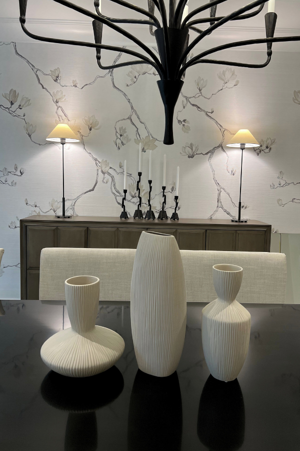
Play with Crops and Compositions
Composition influences interpretation. A wide frame presents the logic of the space, while a close crop draws attention to material and texture. The same corner can communicate different moods depending on proximity.
A tighter image often reads as more intimate and therefore more aligned with cooler months, while a wider view can feel expansive, almost vernal. Shooting multiple angles of each vignette ensures flexibility later, when imagery may be needed for differing narrative or marketing purposes.
Revisiting older images can yield similar results. A simple re-crop or change in orientation can uncover new uses for previously published work. This flexibility matters for long-term portfolios where repetition can dull impact. A well-photographed space holds multiple readings; what changes is the emphasis. Thinking about composition as an evolving resource helps build a visual archive that matures with the studio’s practice.
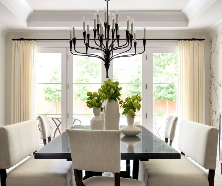
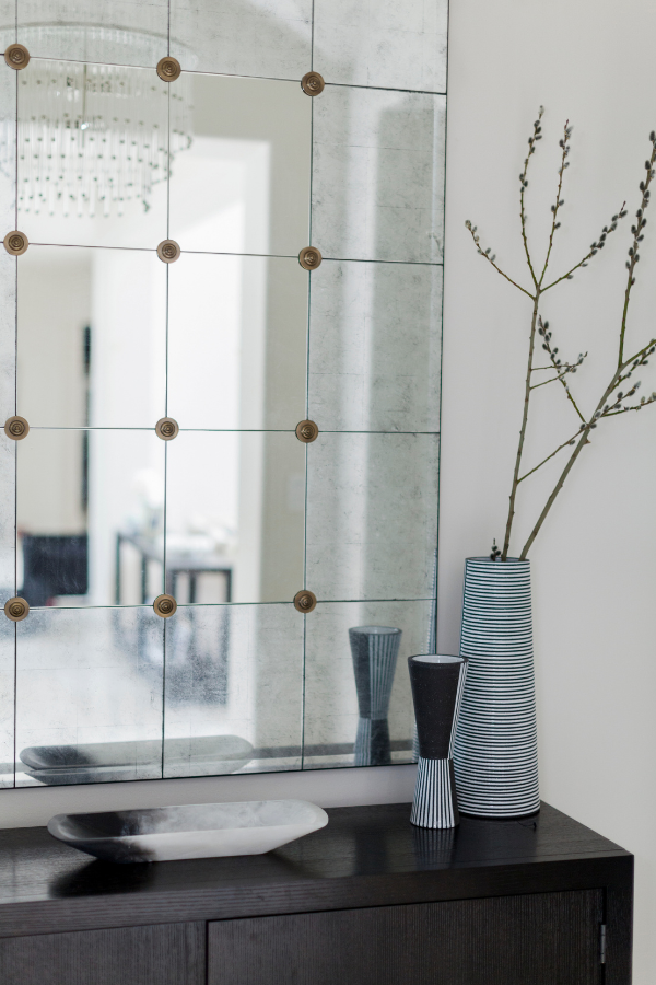
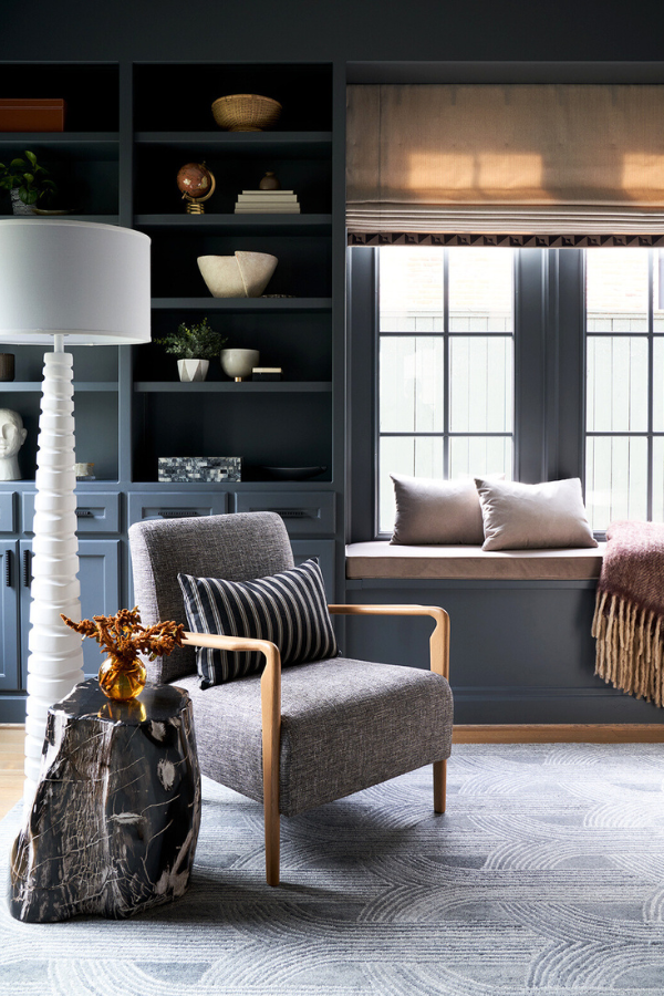
See how the wide-shot photo directly at the beginning of this section appears bright and summery, but the detail photo of black and white accents above has a wintery appearance? It’s the same space but feels so different!
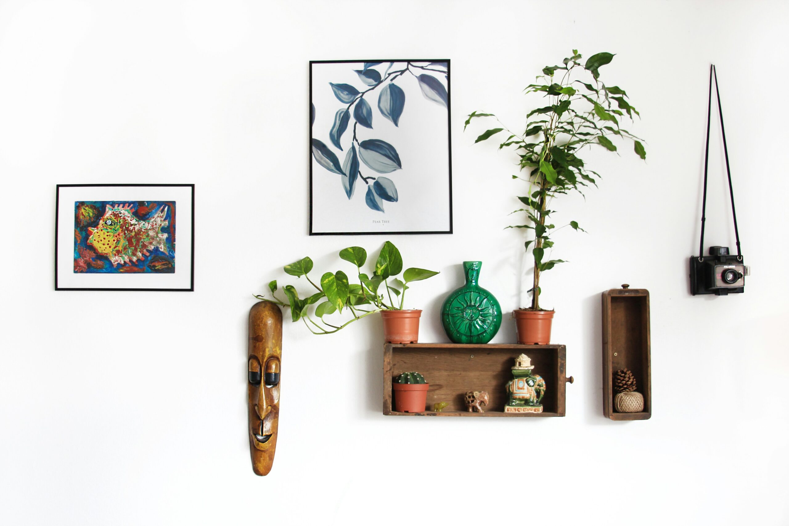
Build a Prop Capsule for Shoots without Stylists
Stylists maintain a set of reliable pieces that photograph well regardless of context, but designers can, too. These objects become part of a broader visual vocabulary. Keeping a small inventory of these elements allows for consistent refinement across shoots. They need not dominate the frame; their purpose is to provide continuity, to bridge one project to the next, and to subtly articulate the designer’s hand.
“The seasonal urge is strong in poets.” — Helen Bevington
We wonder, why not designers, as well?
A prop capsule also prevents over-reliance on trend-driven styling. A consistent collection of objects structures the visual language of your brand. Over time, familiar pieces become recognizable, not repetitive, and their reappearance across projects suggests authorship. Hence, both evergreen and seasonally appropriate content!
Infuse Spaces with the Inherent Seasonality of Natural Light
Light has an inherent seasonality. Its angle, intensity, and temperature all shift throughout the year, often more significantly than color trends or materials. Planning shoot times around these variations can eliminate the need for extensive post-production. When approached with awareness, natural light alone can suggest both time and tone.
Attention to light also conveys a sense of place. A sunlit kitchen in late afternoon feels distinctly different from the same space captured in morning clarity. These choices reinforce the narrative of a home that exists in real time. For designers working on projects across regions, documenting light conditions reveals geography; the difference between Southern and Northeastern light, for example, can be striking. The ability to read and use that variance often separates polished imagery from work that feels situational and lived-in.
Edit for Seasonal Emotion
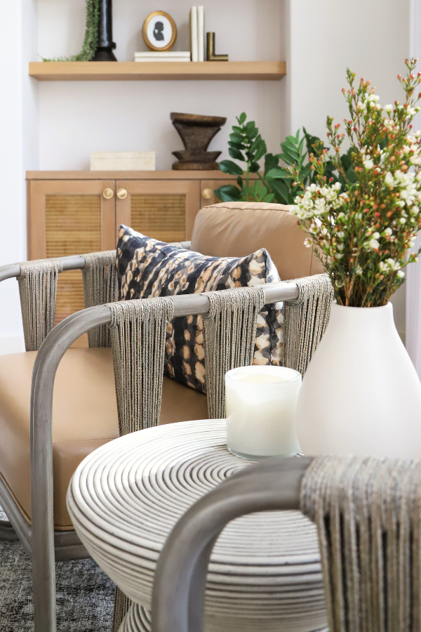
Of course, post-production gives you yet another layer of control. Adjusting warmth, contrast, or exposure can align an image with a specific mood or marketing period. Warmer edits with higher brightness work well for spring or early summer campaigns; slightly cooler, lower-contrast versions lend themselves to a more wintery content. The difference may be minimal, but the psychological effect is tangible.
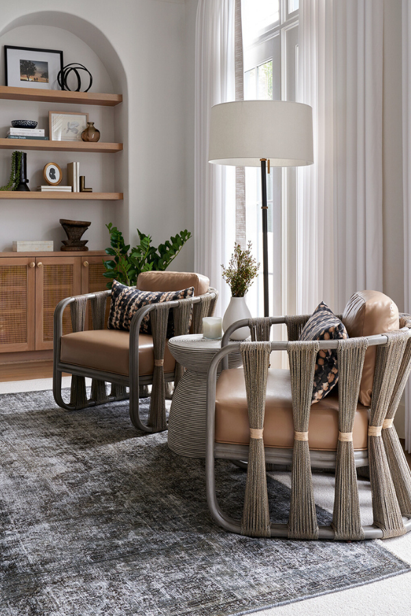
As shown in the two shots of a living room in this Houston home, the changes can be small but impactful. As you might imagine, this stage benefits from restraint. The most effective edits maintain a believable connection to how the room might appear under natural conditions. A consistent editing approach also strengthens the credibility of a designer’s portfolio. Viewers can sense when a photograph has been overly managed; subtle adjustments preserve trust. Editing, when handled thoughtfully, extends the usefulness of imagery without distorting its truth.
Fuel your creative fire & be a part of a supportive community that values how you love to live.
subscribe to our newsletter
*please check your Spam folder for the latest DesignDash Magazine issue immediately after subscription
Maintain Brand Consistency
Styling flexibility should not compromise visual identity. Consistency across lighting, tone, and composition establishes recognizability and authority. Designers known for restraint, for instance, can maintain that quality even as they experiment with seasonal shifts.
The viewer should perceive evolution, not departure. Maintaining this balance creates longevity; the portfolio feels current without appearing reactive.
This steadiness communicates professional maturity. Editors and clients value a clear visual point of view, one that evolves naturally but remains grounded in principle. A coherent portfolio tells a story about control (control of palette, of light, of tone) and that control builds confidence. When seasonal adjustments occur within that framework, they enhance the work rather than distract from it.
Plan a Year’s Worth of Content from One Shoot
Photographing a completed project gives you the opportunity to build a full calendar of imagery. A thoughtful shot list can accommodate both evergreen portfolio pieces and smaller seasonal vignettes. Capturing these variations at once allows a designer to release work gradually throughout the year, keeping social feeds and press outreach active. You can also more easily respect the client’s home and reduce the disruption that additional staging sessions might cause.
In practice, this might mean capturing each angle in several versions: daylight and evening, neutral and warm styling, open and contained compositions. Later, those differences become invaluable when you need new material without new photography. The process also encourages critical observation. Seeing a space through multiple lenses helps clarify its strongest moments and reinforces what aspects of your design philosophy translate best in imagery.
Don’t Forget the Outdoors
Exterior views can extend a project’s narrative. When included in a photoshoot, they give seasonal markers that can later be emphasized or subdued. In spring and summer, open doors, reflections of greenery, or light passing through sheers suggest vitality. In fall and winter, closer framing, overcast light, or the faint glow of interior lamps evoke containment and warmth. These cues require no major restyling, only attention to timing and atmosphere.

Outdoor shots also have a documentary role to play. They connect interiors to their environment and provide visual context for the project as a whole. Even partial views help audiences understand how the space functions across time. These details remind viewers that design is not static. It exists in shifting light and weather and season, and that temporal quality gives images a sense of realism that endures beyond trend or marketing cycle.
Final Thoughts on Seasonal Staging
Seasonal staging is less about orchestrating change and more about seeing potential. When designers plan with those subtleties in mind, they’re able to draw more from the space than it initially offers.
What’s interesting is that nothing truly changes. The furnishings stay where they are. The palette remains intact. Yet through styling, framing, and editing, a single moment can stretch from your portfolio to your holiday cards to your summer reels.
It can feel like spring or fall depending on how it’s seen. That ability, to extend the relevance of an image without falsifying it, speaks to an understanding of design as a living practice rather than a static one. A well-composed photograph doesn’t freeze a room in time. It understands how the space will evolve over time.
Written by the DesignDash Editorial Team
Our contributors include experienced designers, firm owners, design writers, and other industry professionals. If you’re interested in submitting your work or collaborating, please reach out to our Editor-in-Chief at editor@designdash.com.
Related Posts
Understanding the Importance of Branding for Interior Designers
LIKE 0 LEAVE COMMENT 0 7 min read Summary Reflection Questions Journal
The Best Real Estate Shows on HBO, Netflix, Hulu, and Amazon
From Stay Here to Selling Sunset to Buying Beverly Hills, below are tw
Interior Design Client Management: Essential Strategies for Success
LIKE 0 LEAVE COMMENT 0 8 min read Summary Reflection Questions Journal

Everything You Need to Know About the NCIDQ Exam
We outline the structure of the NCIDQ Exam, explain how to study for i

10 Floral GP & J Baker Fabrics We Love for Spring and Summer
With their rich heritage, delicate embroidery, and beautiful prints, G

Pricing Strategies for Interior Designers
LIKE 0 LEAVE COMMENT 0 6 min read Summary Reflection Questions Journal