Six Designer-Approved Purple Paint Colors for Bold Interiors

 0
0
Summary
Purple paint is far more flexible than its reputation suggests. These six designer-approved shades show how purple can add depth, warmth, drama, and polish to bars, dining rooms, cabinetry, foyers, and powder rooms.
Reflection Questions
Where could purple add depth to a project without overpowering the rest of the palette?
Would a gloss, satin, or matte finish change how confidently you could use a saturated purple?
Which surrounding materials would make purple feel more refined in your work: brass, marble, warm wood, patterned textiles, or something else?
Journal Prompt
Think of a color you usually avoid specifying. What would need to change, whether finish, lighting, materials, or context, for that color to become viable in one of your current projects?
Purple is polarizing, but from deep mulberry finishes to soft violet undertones, this royal color gets an undeserved bad rap. It’s often dismissed as overly feminine or reserved for children’s rooms, when in reality, designers have been using purple paint to create some of the most layered, memorable interiors.
From high-gloss dining rooms to tailored cabinetry and richly saturated living spaces, these six popular purple paint colors prove that the hue has far more range than it’s given credit for.

Six Popular Purple Paint Colors Worth the Hype
Brinjal No. 222 by Farrow & Ball
We open our list of ten designer-approved purple paint colors with an aubergine hue from Farrow & Ball. Rich and red-leaning, this warm-toned purple can be used everywhere from petite powder rooms to dramatic dining rooms. Inspired by the skin of an eggplant, we love it in historic houses and in rooms with various light sources because the full gloss finish beautifully reflects that luminosity.
Our team has seen Brinjal used in a number of different ways, but we were especially drawn to a mudroom by Thomas Mach Interiors, a kitchen by Alison Haltom, and a color-drenched living room by Oho Interiors.
In Thomas Mach Interiors’ mudroom, Brinjal covers the cabinetry, cubbies, bench, and paneled back wall, so the room feels fully considered despite its practical purpose. Brass hooks and pulls brighten the aubergine finish, while the herringbone brick floor reminds one of this space’s functionality.
Alison Haltom’s kitchen uses Brinjal across the cabinetry, island, and curved range hood. The color pairs beautifully with marble counters, brass hardware, warm wood floors, and that unexpected yellow fireplace in the next room, which makes the kitchen feel layered rather than overly coordinated.
In Oho Interiors’ Historic Mayo living room, Brinjal is used on the walls, trim, fireplace surround, and ceiling. The color feels especially appropriate in a nearly 150-year-old home, where the crystal chandelier, patterned drapery, plaid bench, and upholstered seating all create a richly collected room that still seems relaxed enough for post-dinner conversation.

Pelt No. 254 by Farrow & Ball
Also from Farrow & Ball, Pelt No. 254 is a deeper, bluer purple than Brinjal. The brand describes it as “a deliciously deep purple,” and in darker spaces, it can approach black but never loses its rich, plum undertone. Though you might be tempted to use Pelt as an accent color, we feel that it makes the most sense when used generously. Go big or go home!
Lozano Jolas Interiors used Pelt across the walls, trim, and ceiling of a Chicago den photographed by A.C. Miller. The room’s architectural detailing gives the color plenty of edges to catch the light, while the crystal chandelier, gilt-framed art, pale upholstery, and parquet floors ensure that the den feels entirely elegant rather than severe. The completed space is dramatic but still refined enough for a room meant to be used rather than simply admired.
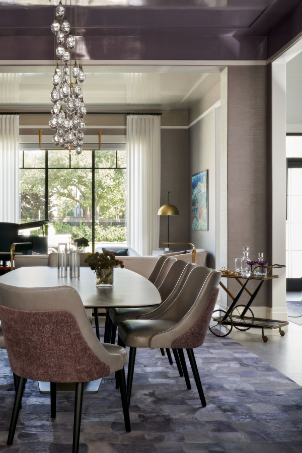
Autumn Orchid by Sherwin Williams
Autumn Orchid by Sherwin-Williams is a softened purple with gray and brown in the mix, so it has a more restrained, adaptable quality than many lavender or lilac paint colors. With an LRV of 29, it still has enough depth to define your next project, but it doesn’t dive into the same dark purple territory as Brinjal or Pelt. It feels especially suited to palettes with warm wood, aged brass, cream, or pale yellow.
In the dining room pictured above and featured by HGTV Magazine, designer Heena Gardner used Autumn Orchid across the walls, adjacent trim, and door. She described wanting “a soft, romantic shade of purple” that would complement the home’s warmth. The original flooring and wood dining chairs pull out the brown in the paint, while the white tulip table, sculptural lighting, and framed portrait keep the room from feeling too muted.
Is it the perfect color for lovers of light purples? Possibly!
Plum Brown SW 6272 by Sherwin-Williams
Plum Brown by Sherwin-Williams is a muted, brown-based purple with enough depth to feel tailored but not severe. It belongs to Sherwin-Williams’ Restorative Darks palette, though in this application, it reads more like a softened plum than a true dark paint color. The brown undertone makes it quite versatile, while the purple gives the cabinetry more interest than a standard espresso or charcoal finish.
In this Denver kitchen by Plum Kitchens Design, Plum Brown is used across the tall pantry cabinets and lower cabinetry. The reeded fronts bring out the variation in the paint, especially where light hits the vertical grooves. Brass hardware, pale flooring, marble counters, and the herringbone backsplash make the composition feel calm and neutral despite the bold pop of color.
It’s a great choice for custom cabinetry when a client wants a color with depth, but not the intense drama of Brinjal or Pelt.
Plum Sauce by Dulux
Plum Sauce by Dulux technically belongs to the red family, but it earns a place on this list because its brown and blue undertones push it toward plum. With an LRV of 9, it has real depth, though the color is warmer and earthier than Pelt or Brinjal. Dulux places it within its 2025 Recollect Palette, which makes sense for a shade that feels tied to vintage rooms, patterned textiles, and older houses with plenty of personality.
In this Catherine Martin Designs space, Plum Sauce is used across the walls, trim, and ceiling of a small sitting room, while Dulux Auburn Flair frames the arched opening and adjacent walls beyond. The two colors create a warm passage into a deeper, moodier room. The striped sofa, red drapery, floral rug, black-framed art, and glass-topped table all make the palette feel layered and nostalgic instead of overly themed.
This is a great paint color for anyone drawn to purple but wary of anything too violet. It would work beautifully in a den, entry, hallway, powder room, or small bedroom where the goal is warmth, color, and a little drama. Take this as your sign to try a fun color like Plum Sauce in your next project!
Fuel your creative fire & be a part of a supportive community that values how you love to live.
subscribe to our newsletter
*please check your Spam folder for the latest DesignDash Magazine issue immediately after subscription
Black Raspberry by Benjamin Moore
Black Raspberry by Benjamin Moore is our editor’s personal favorite on this list. With brown undertones and an LRV of 6.78, it has the earthy richness of deep mulberry without losing its purple identity. It is darker than many popular purple paint colors, but the color still has enough warmth to pair beautifully with wood, brass, marble, patterned rugs, and antique pieces.
In the Cusp Interiors bar pictured above, Black Raspberry appears across the cabinetry and paneled walls, while a mirrored backsplash, glass shelving, wine storage, and marble surround add glamour without making the space feel too polished. The ceiling treatment brings in another layer of pattern, and the white counter creates a clear break between the dark cabinetry and the reflective tile.
Stollar Fearins Welch used Black Raspberry in high gloss throughout the foyer of a West End Avenue apartment featured in Cottages & Gardens. The glossy walls, doors, trim, and ceiling catch the light around the globe pendant, while the antique cabinet and patterned rug introduce warmth and age. This space is such a beautiful example of how a dark purple paint can make a statement the moment someone enters a home.
Are You Rethinking Purple Paint Colors in Your Projects?
Purple is far more versatile than it’s often given credit for. It can be soft or bold, warm or cool, traditional or entirely modern depending on the shade, finish, and surrounding materials. It belongs just as easily in a dining room, bar, kitchen, or entry as it does in a bedroom or powder bath, and in many of the spaces above, it becomes the defining element rather than a secondary accent.
If you’ve used purple in your own home or design projects, we would love to see it. Send your work to editor@designdash.com for a chance to be featured on the site, in the magazine, and across our social channels.
Written by the DesignDash Editorial Team
Our contributors include experienced designers, firm owners, design writers, and other industry professionals. If you’re interested in submitting your work or collaborating, please reach out to our Editor-in-Chief at editor@designdash.com.
Related Posts
How Long Do Artists Hold Copyright, and Are There Any Exceptions?
From painters and sculptors to photographers and digital artists, crea
Three Takeaways from Episode 97: What To Do With a Client Who Won’t Stop Revising?
Laura Umansky and Melissa Grove share three lessons on handling client
What is Quiet Luxury Interior Design, And is it Still In?
Beyond trends and comparisons with minimalism, learn what quiet luxury

Women, In Their Own Words: Paulina Hospod
Enjoy insights from Paulina Hospod of AhA!nteriors in our “Women, In

All You Need to Know About London Design Festival 2025
London Design Festival 2025 returns this September with bold installat

Eight Fringed Light Fixtures to Capture the Interior Design Trend
From leather tassels to jute-wrapped shades, these eight fringed light