
The Psychology Of Color: Blue In Interior Design, Branding, And Beyond

 1
1
Summary
The color blue is deeply connected with calmness, trust, and stability, evoking feelings of tranquility and reliability. This article explores blue’s significant role in interior design, branding, art, religion, and modern contexts. From creating peaceful home environments to establishing trust in corporate identities, blue’s psychological impact is powerful. The article also delves into blue’s historical uses, emotional interpretations, and symbolic meanings across various domains, demonstrating how this color profoundly shapes our lives and perceptions.
Reflection Questions
How does the color blue affect your mood and behavior in different settings, such as at home, in nature, or in a retail environment?
Can you identify brands that use blue effectively in their logos and marketing? How do these brands make you feel about their products or services?
Reflecting on the cultural variations of blue, how does your cultural background influence your perception and use of this color?
Journal Prompt
Think about a space in your home or a place you frequently visit that prominently features the color blue. Describe how the presence of blue in this space makes you feel. Consider how different shades of blue might change the atmosphere and your emotional response. Write about how you might incorporate more blue into your surroundings to enhance your well-being and create a balanced environment.
Few colors are as versatile and emotionally impactful as blue. From creating serene sanctuaries to sophisticated professional environments, blue plays a key role in shaping the atmosphere of our spaces. Whether it’s the calming influence of sky blue in a bedroom or the refined elegance of navy blue in an office, each shade of blue evokes a different emotional response. In this article, we explore how employing blue color psychology can transform interiors, impact branding, and influence our behavior. We’ll break down how blue is used in both interior design and branding, and why it’s the go-to color for conveying trust, relaxation, and clarity. By understanding the emotional and physiological effects of blue, designers can unlock its full potential, crafting spaces that enhance well-being, productivity, and creativity. With blue, there’s more than just color—it’s a mood, a message, and a lasting impression.
An Introduction to Color Psychology
Color psychology is the study of how colors affect human emotions, behaviors, and perceptions. It examines the impact different hues have on our mood and decision-making processes and how these effects can be utilized in various fields such as marketing, design, and art. Colors can trigger a range of emotional responses, from feelings of calm and relaxation to excitement and urgency. Cool colors tend to be perceived as calm, while warm colors are more associated with energy.
The color blue holds a significant place in color psychology due to its associations with calmness, trust, and stability. Blue is often linked with the daytime sky and the sea, evoking vastness and peace. It is a non-threatening color, known to lower blood pressure and body temperature, making it a popular choice for creating calm environments. Blue light, particularly, has been shown to have a calming effect on the mind and body. Dark blue, navy blue, and royal blue evoke a sense of sophistication and security, while lighter shades of blue like sky blue and baby blue bring a feeling of peace and clarity.

Additionally, blue symbolizes loyalty, security, and professionalism, making it a staple in branding and corporate environments. In interior design, the calming blue meaning associated with blue allows it to promote relaxation, tranquility, and mental clarity. The positive associations of the color make it ideal for spaces where people want to feel at ease and productive.
Color Theory vs. Color Psychology: Understanding the Difference
While both color theory and color psychology are crucial to creating effective and emotionally resonant designs, they approach color from different perspectives, each offering unique insights into how we perceive and interact with color in interior spaces.
What is Color Theory?
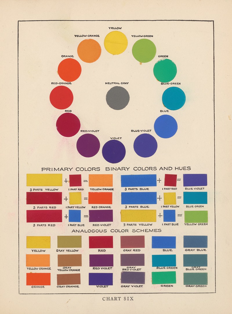
Color Theory refers to the principles and guidelines used by designers and artists to understand how colors interact with each other. It is rooted in the visual and aesthetic relationships between colors and involves concepts like the color wheel, complementary colors, analogous colors, and the way colors are mixed to create harmony and balance in a composition.
For example, blue and orange are complementary colors on the color wheel, meaning they create high contrast and visual interest when paired together. In interior design, color theory helps designers choose contrasting colors or harmonious color combinations to create specific visual effects and aesthetic appeal.
What is Color Psychology?
On the other hand, color psychology is the study of how colors influence human emotions, behaviors, and physiological responses. Unlike color theory, which focuses on the technical and aesthetic aspects of color, color psychology delves into the emotional and subconscious impact of color.
For instance, blue is often associated with calmness and relaxation in color psychology, but it can also evoke sadness or introspection depending on the shade used. Lighter shades of blue may promote peace and clarity, while darker blues can be linked to feelings of stability or even melancholy.
How Do They Differ?
While color theory is primarily concerned with color harmony, balance, and visual composition, color psychology helps designers understand the deeper emotional and psychological effects that colors can have on individuals within those spaces. By integrating both approaches, interior designers can craft spaces that are not only visually appealing but also psychologically nurturing, using blue and other colors in ways that promote well-being, creativity, and productivity.
Blue Color Psychology: Interpreting Different Shades of This Calming Color
Darker shades of blue, such as navy blue and royal blue, are commonly associated with professionalism, stability, and trustworthiness. These deeper shades convey a sense of authority and security, which is why blue is widely used in corporate and financial settings. Navy blue and dark blue evoke sophistication and a timeless quality, often symbolizing strength and confidence. These tones are frequently used in business attire, logos, and even law firms to communicate reliability and professionalism.
In interior design, darker shades of blue are perfect for creating spaces that feel comforting and grounded. Blue rooms painted in navy blue or royal blue have a depth that suggests stability and trust. Blue spaces in living rooms or study areas can benefit from blue color psychology by fostering an atmosphere that encourages focus and relaxation without overwhelming the senses.

Lighter shades of blue, such as sky blue or baby blue, evoke tranquility, open-mindedness, and creativity. These lighter shades of blue are often seen as peaceful and soothing, bringing a sense of clarity and openness. They are ideal in environments where people need to focus and think creatively. For example, in an office or creative studio, lighter shades of blue can help boost mental clarity and foster a productive atmosphere.
When pairing blue with other complementary colors, designers can create high contrast without overwhelming the space. The color wheel suggests that blue pairs beautifully with shades like orange and yellow, allowing for a vibrant yet balanced aesthetic.
Fuel your creative fire & be a part of a supportive community that values how you love to live.
subscribe to our newsletter
*please check your Spam folder for the latest DesignDash Magazine issue immediately after subscription

Cultural Variations in the Perception, Importance, and Use of Blue
Blue, as a color, holds diverse meanings and symbolisms that vary significantly across different cultures. These variations influence how blue is perceived, its importance, and its use in various fields, such as art, religion, and everyday life.
Western Cultures
In Western cultures, blue is traditionally linked with trust, loyalty, and wisdom. It is seen as a color of calm, which is why it is often chosen for uniforms and corporate logos. Blue uniforms are commonly used in professions that require reliability and trustworthiness, like police officers and healthcare workers. Blue is also associated with peace, often used in international contexts like the United Nations and various peace-related initiatives. However, blue can also symbolize sadness or melancholy, as reflected in the common phrase “feeling blue.”
Eastern Cultures

In Eastern cultures, blue is often regarded as a color of immortality and strength. In China, blue is associated with immortality and is frequently used in art and decoration. It is also connected to serenity and spiritual transcendence. In Japan, blue is symbolic of purity and often appears in traditional kimono designs.
Blue as a Spiritual Color
Throughout history, blue has held great spiritual meaning in various cultures and religions. Its connection to the sky and the sea has made it a symbol of the divine, eternal life, and spiritual transcendence. Blue color psychology isn’t only about calming effects but also extends to spiritual realms, evoking peace, serenity, and a sense of connection to the higher self or the universe.
Blue in Religious and Spiritual Symbolism
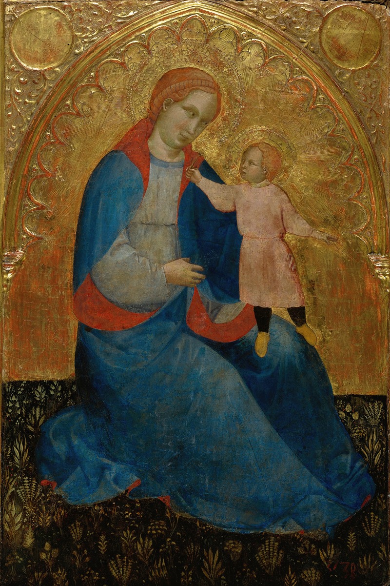
Blue is often associated with the heavens, divine protection, and spiritual enlightenment. In Christianity, blue is a color linked to the Virgin Mary, symbolizing purity, grace, and heavenly connection. It is frequently seen in religious art, particularly in depictions of the Madonna, where her blue robes convey her spiritual and maternal significance.
In Hinduism, blue is the color of Lord Krishna, one of the most revered deities, symbolizing the infinite nature of the divine. The blue skin of Krishna represents his connection to the eternal and his embodiment of the spiritual qualities of love, compassion, and protection.
Islam also places blue in a spiritual context, as it is often considered the color of paradise. The blue mosque in Istanbul, for example, is a symbol of divine beauty and sacred space. Blue tiles and decor often adorn mosques and religious texts, representing the heavens and the divine light.
Blue in Meditation and Healing
In the context of meditation and spiritual healing, blue is considered to have calming properties that help balance the throat chakra, which is associated with communication, self-expression, and truth. Blue light therapy is used to enhance mental clarity and emotional healing, helping individuals achieve a peaceful and centered state of mind. The soothing qualities of blue make it an excellent choice for spaces designed to promote relaxation, mindfulness, and spiritual well-being.
Blue in Art and Spiritual Expression
Artists throughout history have used blue to represent the spiritual and transcendent aspects of human existence. Pablo Picasso’s Blue Period (as discussed later in this article) conveyed a deep emotional and spiritual connection to human suffering. He associated blue with heartbreak, loss, and loneliness, using this color to explore themes of poverty and isolation. The spiritual depth of blue in this period was a reflection of Picasso’s personal inner turmoil.
On the other hand, Claude Monet’s famous Water Lilies series, which uses various shades of blue, invites the viewer into a tranquil space that evokes spiritual reflection, peace, and contemplation. The calming, reflective qualities of blue mirror the connection between nature, the divine, and the human spirit.
Blue in Art, Interior Design, Branding, and Beyond
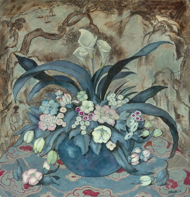
Blue in Fine Art: Evoking Emotion and Meaning
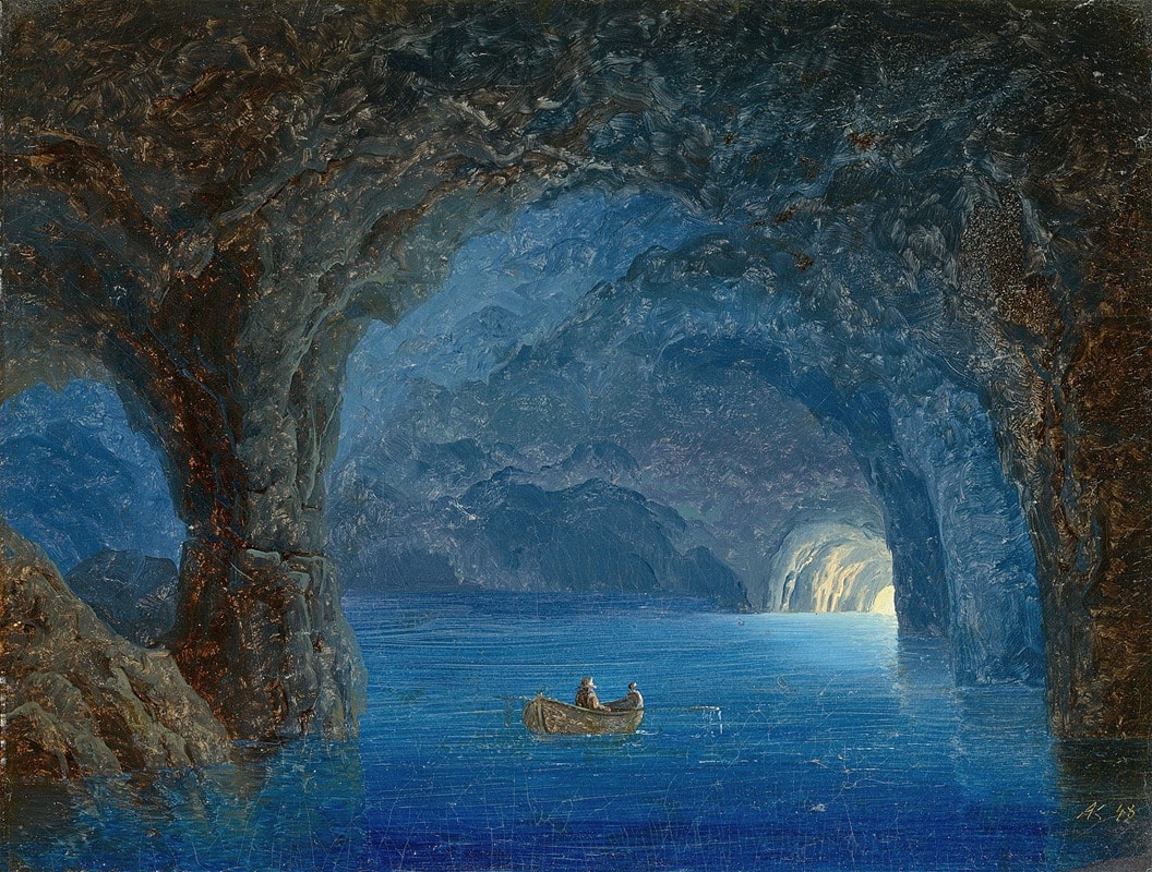
Throughout the history of fine art, blue has been used to convey a wide spectrum of emotions, from the tranquility and peace often associated with its calming hues, to the darker, more melancholic tones that evoke feelings of sadness and introspection. One of the most notable examples of blue’s emotional depth in art is Pablo Picasso’s Blue Period (1901–1904).

During this time, Picasso used varying shades of blue to explore themes of poverty, loneliness, and despair. The blue period works, such as The Old Guitarist and La Vie, are filled with somber, muted blue tones that reflect the artist’s personal struggles and the harsh realities of life. These pieces, while masterfully executed, also capture the negative psychological associations that blue can sometimes evoke, particularly its connection to sorrow and melancholy.

However, blue is not solely a color of sadness. In contrast, the use of blue in fine art can also symbolize peace, healing, and spirituality. Works like Claude Monet’s Water Lilies, which feature serene shades of blue reflecting the clear sky, invite viewers into a world of calm contemplation and tranquility. The gentle blue light in these paintings evokes a sense of stillness and balance, encouraging emotional recovery and a sense of harmony.

Even within the context of a single painting, blue’s psychological impact can vary widely depending on the hues used. While darker blues like those in Picasso’s Blue Period might suggest sorrow or melancholy, lighter shades of blue can represent hope, renewal, and clarity. The versatility of blue allows artists to convey a broad range of human experiences, making it a potent tool for evoking both positive associations and more negative psychological associations, depending on the context.
The psychological power of blue in fine art shows just how complex and layered this color can be. Whether used to depict the depths of human emotion or to create a serene atmosphere, blue plays a vital role in shaping the emotional tone of a piece. For interior designers, understanding these emotional responses to blue can help create spaces that either soothe and calm or provoke deep reflection and introspection, depending on the mood they wish to evoke.
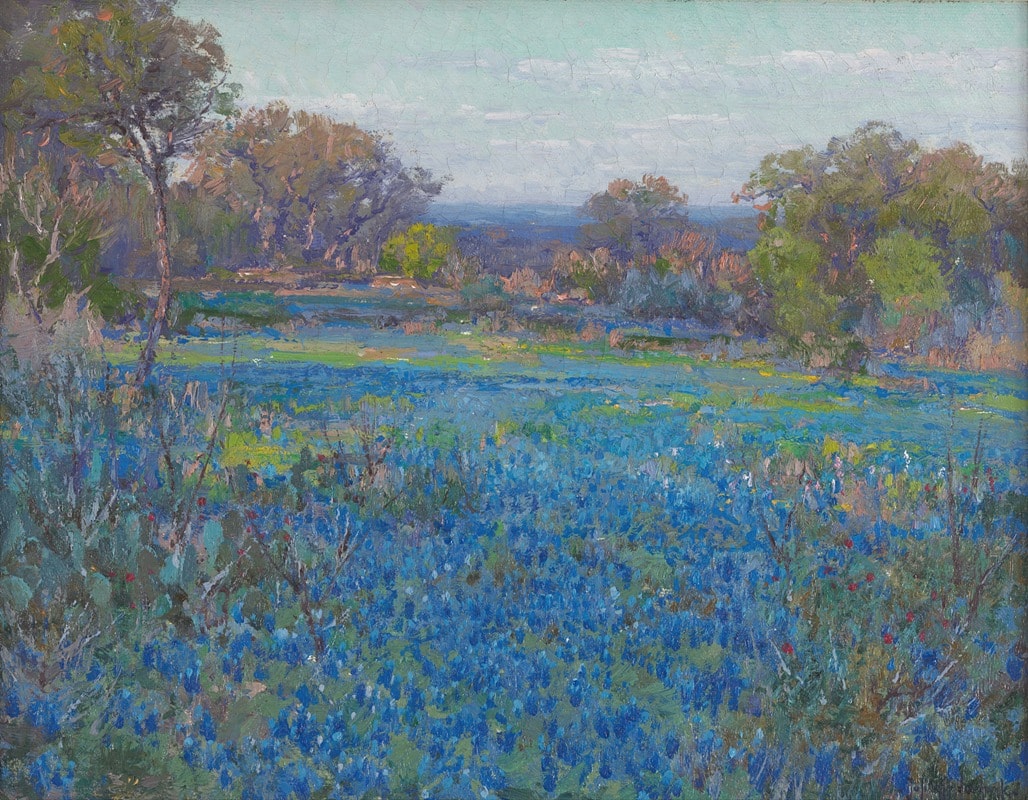
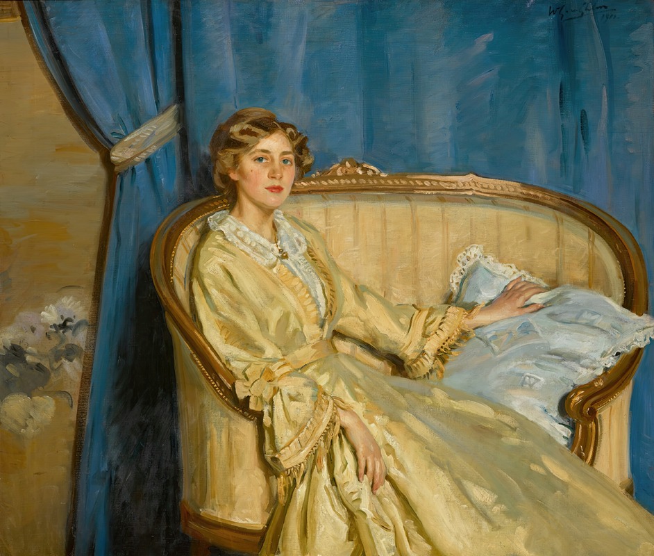
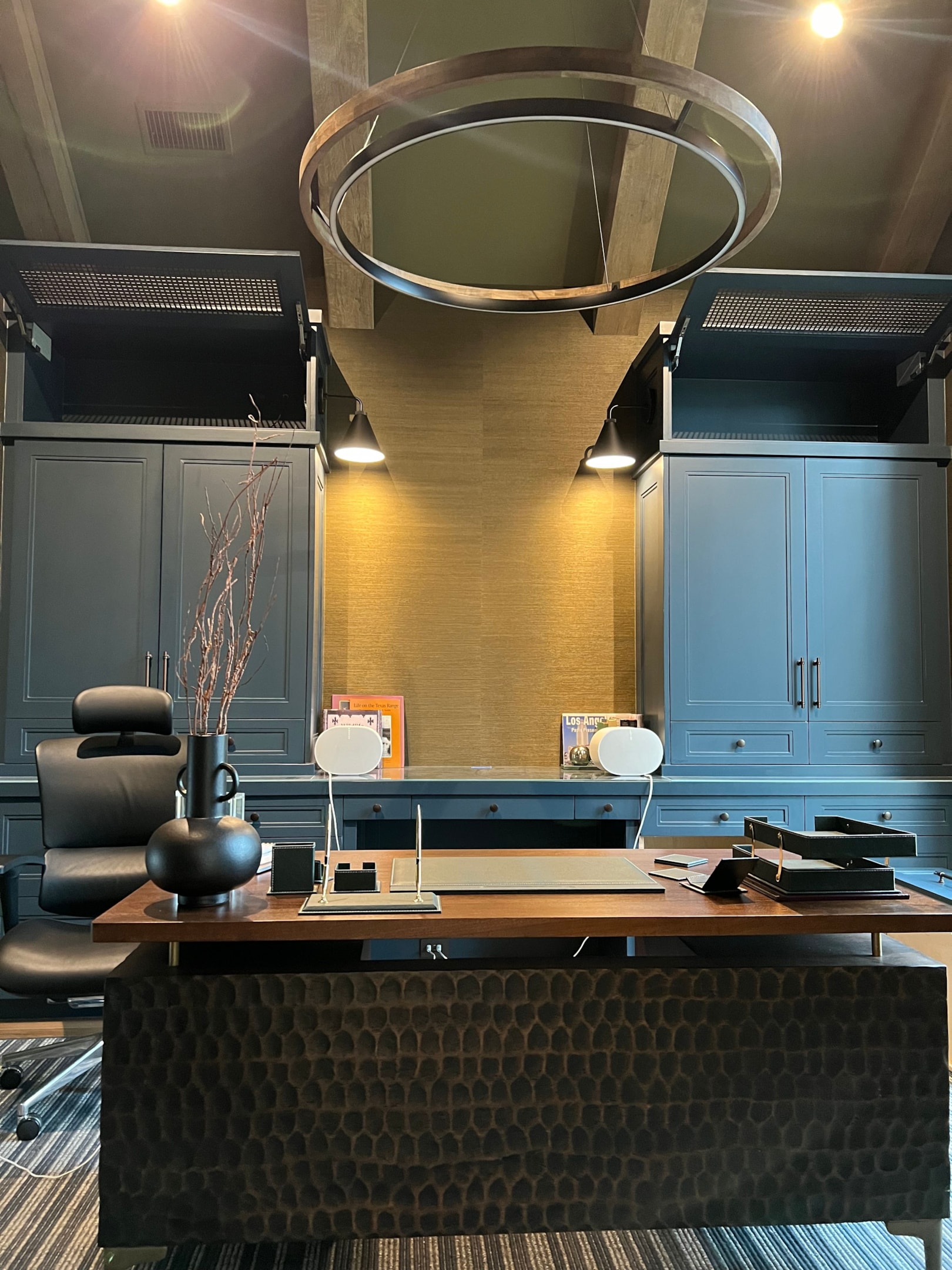
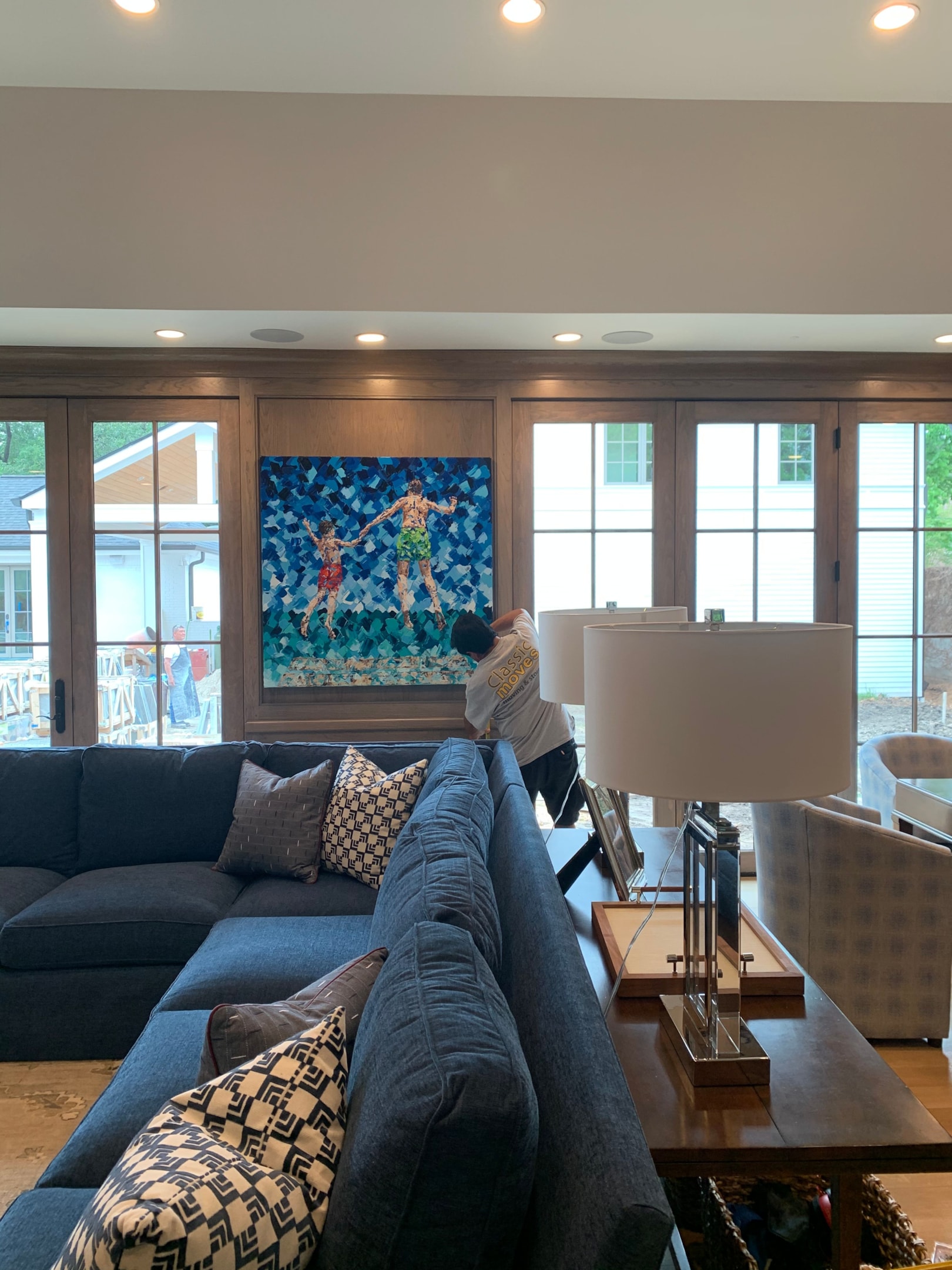
Blue in Interior Design
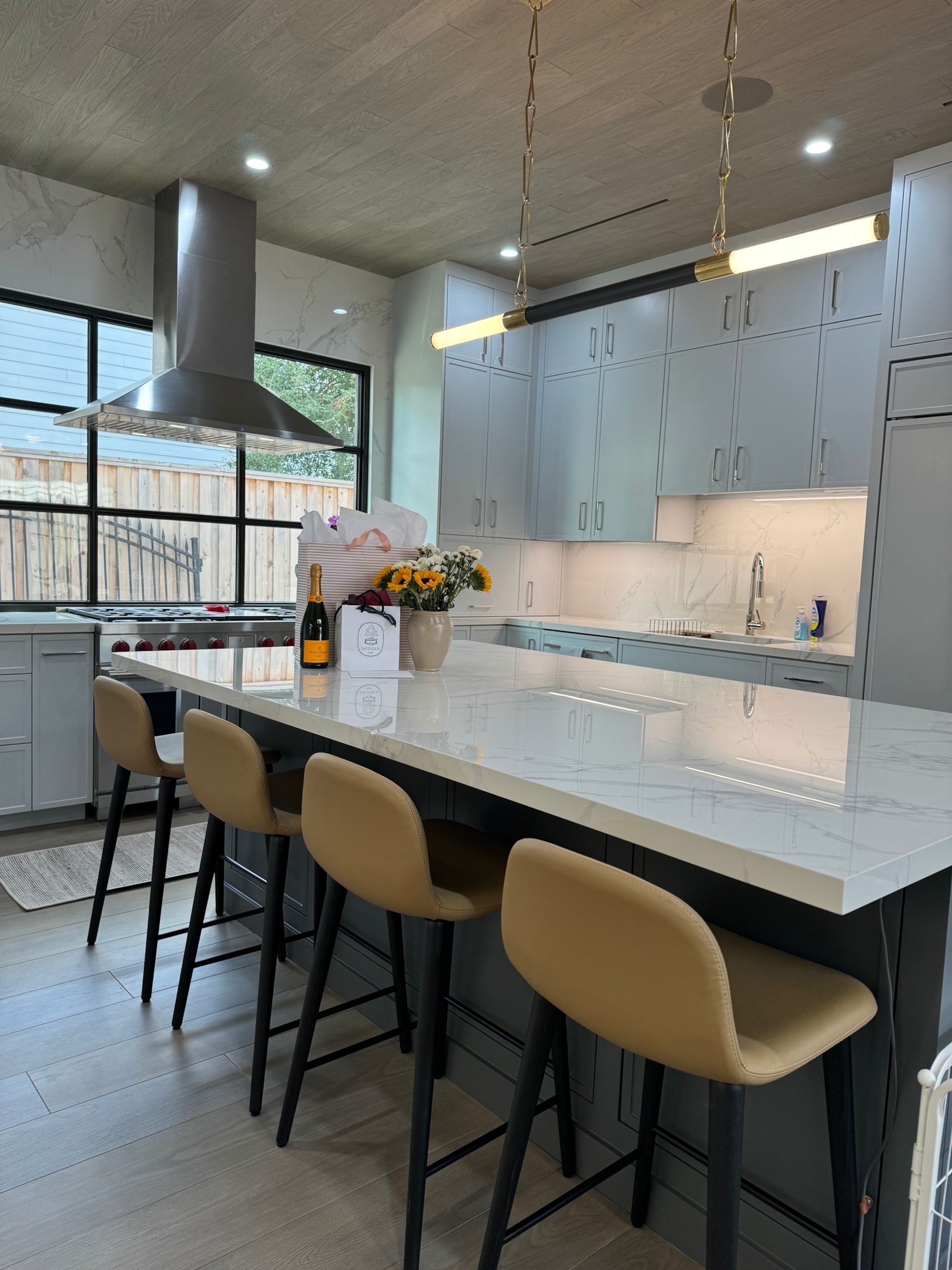
Blue has long been favored for its calming and soothing effects. As a non-invasive and non-threatening color, it is ideal for creating spaces that are intended to promote tranquility and peace. In home interiors, blue rooms painted in various shades of blue foster environments where people feel at ease, whether for relaxation or productivity.
Darker blue shades, such as navy blue, add sophistication and depth to a space, making them perfect for living rooms, libraries, and home offices. Blue spaces in these areas can feel both grounded and stylish, creating an environment conducive to focus and reflection. The presence of dark blue can help reduce heart rate and blood pressure, contributing to a calming atmosphere, which is particularly beneficial in home offices and study areas.
Lighter shades of blue, such as sky blue, are often used in bedrooms and bathrooms, where a relaxing and restorative environment is essential. These lighter blues help create a serene retreat from the stresses of daily life, promoting a sense of peace and relaxation. Lighter blue hues are often associated with the clear sky, making them feel open, airy, and refreshing.
When designing blue rooms, pairing blue with contrasting colors like orange or yellow creates a dynamic, high-energy space, while the use of complementary colors like green or purple can enhance blue’s calming effect. In this way, blue’s ability to work harmoniously with other colors allows designers to tailor each room to meet its purpose, whether for rest, creativity, or focus.
Blue in Branding
Blue is a powerful color in branding, too, because of its ability to evoke trust, security, and professionalism. Numerous studies have shown that blue is one of the most popular colors for logos, as it helps convey reliability and stability—qualities that are especially important in industries like banking, technology, and healthcare.
For example, blue is often used by brands in sectors where dependability is key. Royal blue and navy blue are commonly used by financial institutions to project trustworthiness and security, while sky blue is used by tech companies to communicate clarity and innovation. Blue meaning is also rooted in the physiological responses it evokes, such as lower blood pressure, making customers feel at ease and confident in their decisions.
The positive qualities associated with blue make it an effective choice for brands looking to convey a sense of calm and security. Brands like IBM, Twitter, and Facebook use blue in their logos to evoke trust and reliability. These companies recognize the importance of blue color psychology in shaping consumer perceptions and creating lasting brand loyalty.
When pairing blue with other colors, brands can create unique identities that stand out while maintaining the blue color psychology of trust and reliability. For example, using contrasting colors such as orange in marketing materials can provide a dynamic visual impact, while staying true to the blue meaning of stability and calm.
Final Thoughts on Blue Color Psychology
From creating peaceful interiors to building trusted brand identities, the color blue plays a pivotal role in shaping our emotional and psychological responses. Its associations with calmness, stability, and professionalism make it a powerful color in various domains, from interior design to marketing and art. Shades of blue—from dark blue to sky blue—are incredibly versatile as they invoke tranquility and energy depending on the context. Embracing blue in its many shades can help foster environments that promote clarity, trust, and relaxation, enriching our lives and enhancing our experiences.
Join us for the focus & Flex challenge
Related Posts

Pricing Strategies for Interior Designers
LIKE 0 LEAVE COMMENT 0 6 min read Summary Reflection Questions Journal
Abstract Art in Interior Design: Elevate Your Space with Creative Expression
LIKE 0 LEAVE COMMENT 0 6 min read Summary Abstract art brings emotion,
The New Black: Charcoal, Ink, and Graphite as Core Neutrals
Across showrooms, studios, and recent client projects, black-adjacent

Can I Start My Firm While Still Employed — Or Does That Cross a Line Ethically?
Can designers start a firm while still employed without crossing ethic
Steel, Style, and Substance: The History of Crittall Windows
Crittall windows and doors have long been celebrated for their distinc
Get to Know the DesignDash Team Through a Q&A at Our 2024 Holiday Party!
From favorite traditions to proudest moments, get to know the team and