Victorian Interior Design: Darkness, Drama, and Decorative Ambition

 0
0
Summary
Victorian interiors were built to impress. They were dense, layered, and deliberately theatrical — a reflection of industrial wealth, new social ambitions, and a taste for ornament that bordered on the architectural. Heavy drapery, jewel tones, intricate woodwork, and patterned wallpapers weren’t excess for its own sake; they were the language of the era. Today, designers borrow its richness without its clutter, softening the weight but preserving the mood.
Reflection Questions
What does the Victorian instinct to “fill” a room reveal about how people wanted to be seen in that period?
How does the relationship between light and material shape the atmosphere of a space, both then and now?
When ornament is stripped back but not erased, what remains of a style’s original identity?
Journal Prompt
Think about a room — past or present — that left a strong impression on you. What specific elements created that feeling? Was it light, texture, pattern, scale, or something more atmospheric? Describe it in as much sensory detail as you can.
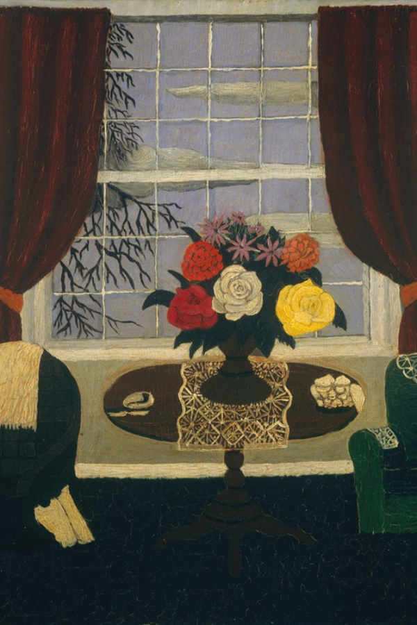
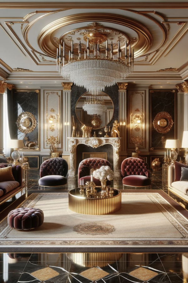
Step into a Victorian room and the first thing that hits you isn’t minimalism. It’s weight. Patterned carpets underfoot, wallpapers that climb the walls like ivy, drapery that falls in thick, confident folds. It’s an interior that doesn’t whisper. It declares.
The Victorian era (1837–1901) unfolded alongside the Industrial Revolution, empire-building, and a restless middle class determined to express its new wealth. Interior design became a language of ambition. Heavy ornament signaled stability, taste, and standing. A parlour didn’t just hold furniture. It held a performance.
A Room Meant to Impress
For Victorians, the home was less about privacy than display. This was the age of the parlour — a stage on which families showed their best selves. Guests didn’t enter through a kitchen or casual living space. They were received in rooms wrapped in saturated colour, layered with plush textiles, and punctuated by objects meant to be looked at more than touched.
This intensity wasn’t simply about taste. It was practical. Gaslight and coal smoke made pale plaster feel washed out. Heavy fabrics softened draughts. Dark wallpapers disguised grime. Jewel tones — emerald, garnet, lapis — glowed in candlelight, giving rooms their unmistakable mood.
The Language of Ornament
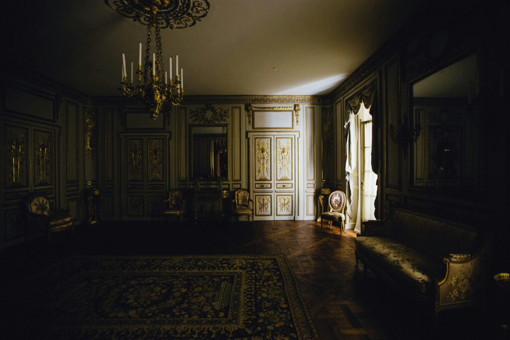
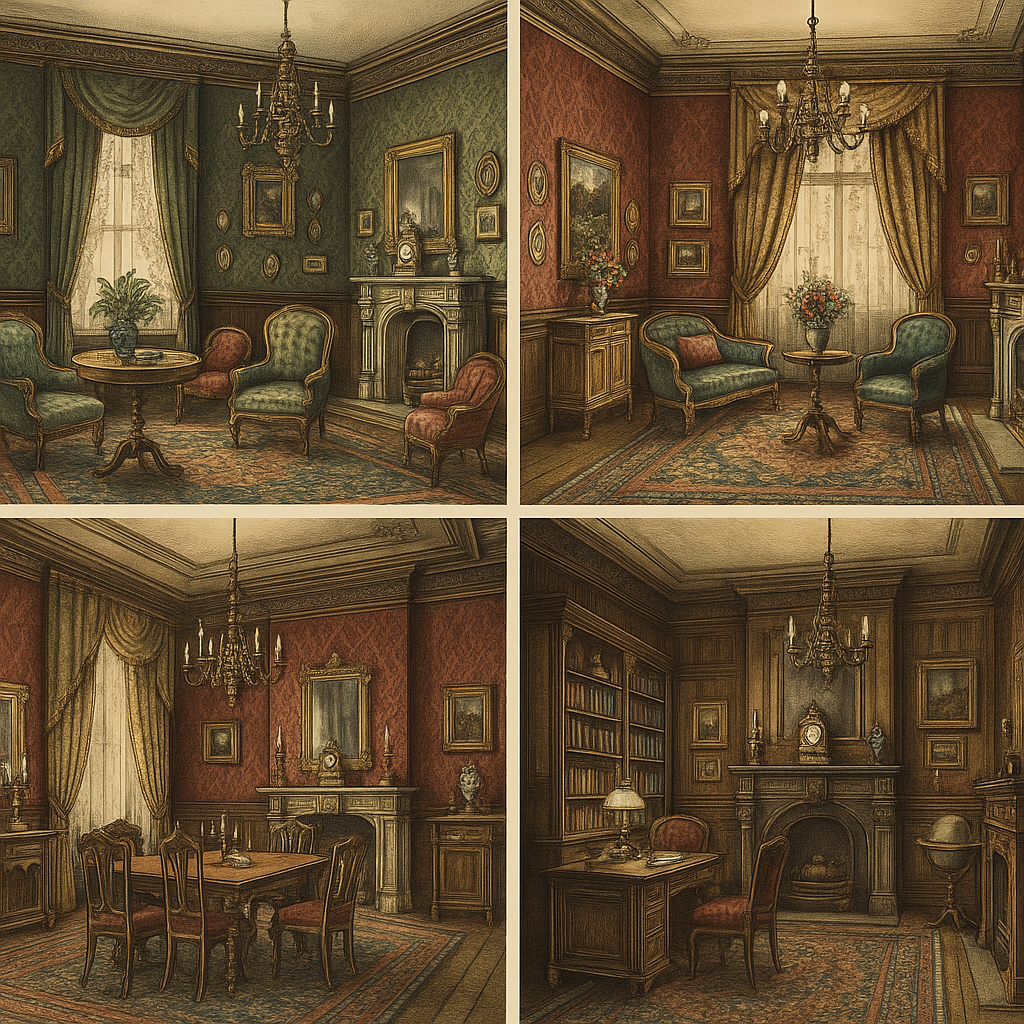
To step through a Victorian home was to move through layers of decoration. Ceilings carried intricate plasterwork; staircases wound through carved balustrades. Walls wore busy floral or damask patterns, often finished with picture rails and dado panelling. Mantels were elaborate. Mirrors were everywhere, not to expand the space but to double its drama.
Furniture was weighty, carved, and proud. Walnut, mahogany, and rosewood framed parlours filled with tufted upholstery and turned legs. Pattern met pattern — rug against wallpaper, curtain against carpet — and it worked because excess wasn’t the exception. It was the point.
Opulence for the Masses
One of the most important shifts of the Victorian period was not just what was designed, but who could afford it. Mass production — a byproduct of the Industrial Revolution — put patterned wallpapers, cast iron grates, and elaborate mouldings within reach of the middle class. What had once belonged to stately homes spread across suburbs and terraced houses.
Ornament became democratic. A well-dressed room might be small, but it could still shimmer with the same aesthetic ambitions as a grand one.
Rooms of Ritual
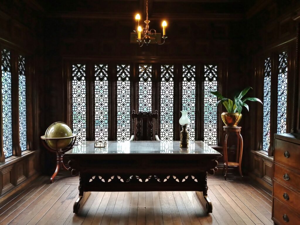
Each space had a role. The drawing room — often the brightest and most formal — was for receiving. The dining room was darker, heavier, intended for long meals and careful conversation. Bedrooms layered lace and velvet with privacy in mind, though never without some decorative flourish. Studies were wrapped in wood panelling and tobacco tones, signalling seriousness and intellect.
No surface was wasted. No corner was left unadorned.
Victorian Influence Today
Victorian design was never meant to be subtle, and that’s partly why it continues to intrigue. Modern designers borrow its textures and colour, stripping back the density but keeping the richness. A carved fireplace against a modern wall. A William Morris wallpaper used sparingly. An antique mirror layered into a contemporary sitting room.
It’s less about imitation than translation. The mood remains — a quiet nod to the decorative ambition of another century — but the air is clearer.
Learn More About Design Trends of Yore
Written by the DesignDash Editorial Team
Our contributors include experienced designers, firm owners, design writers, and other industry professionals. If you’re interested in submitting your work or collaborating, please reach out to our Editor-in-Chief at editor@designdash.com.
Related Posts
The New Black: Charcoal, Ink, and Graphite as Core Neutrals
Across showrooms, studios, and recent client projects, black-adjacent
Should You Hire an Interior Stylist for Project Shoots?
Often working in lock-step with your photographer, the right interior
Bohemian Interior Design: Free-Spirited Style with Eclectic Charm
LIKE 0 LEAVE COMMENT 0 11 min read Summary Reflection Questions Journa
From Andalusia to the Almohad: A History of Moroccan Zellige Tile
You might shop for Zellige tile to adorn your kitchen backsplash, but
Blast from the Gilded Past: Should 1980s Interior Design Make a Comeback?
Considering today’s aesthetics, culture, economic landscape, and bro