Spring HPMKT Design Trends: Color Drenching with Confidence
Summary
Color drenching—the art of saturating a space in a single hue across walls, trim, ceiling, and more—is still going strong in 2025. We saw it everywhere at High Point Market this spring, from moody libraries to softly monochrome bedrooms. Far from flat, these spaces layered finishes, textures, and materials to create immersive, emotionally resonant interiors. Whether you go bold with aubergine or soft with sage, this trend proves that a single color, thoughtfully applied, can transform an entire space.
Reflection Questions
What color are you instinctively drawn to—and how could it set the tone for an entire space?
How might layering textures and finishes in a single color family shift your typical design approach?
Which client projects might benefit from a mood-driven, monochromatic concept?
Journal Prompt
Think back to the last room you designed that made you feel something—calm, inspired, nostalgic, bold. Describe the color story in that space. How might fully drenching a room in a single hue amplify that emotional response? Sketch or write about how you’d bring a monochrome vision to life in your next project.
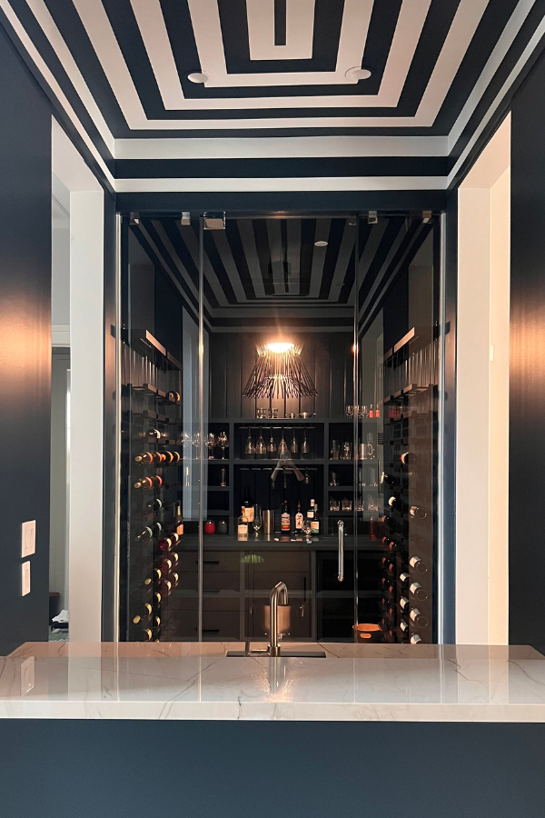
Though the paint trend has circulated throughout residential design (and some commercial spaces) for a few years, the desire for impactful interiors continued this season at High Point. As the design team at Laura U Design Collective noted in their own High Point Market Trend Report, “Single-hue spaces in rich tones created immersive environments. Designers embraced single-color schemes across walls, upholstery, millwork, and accessories.”
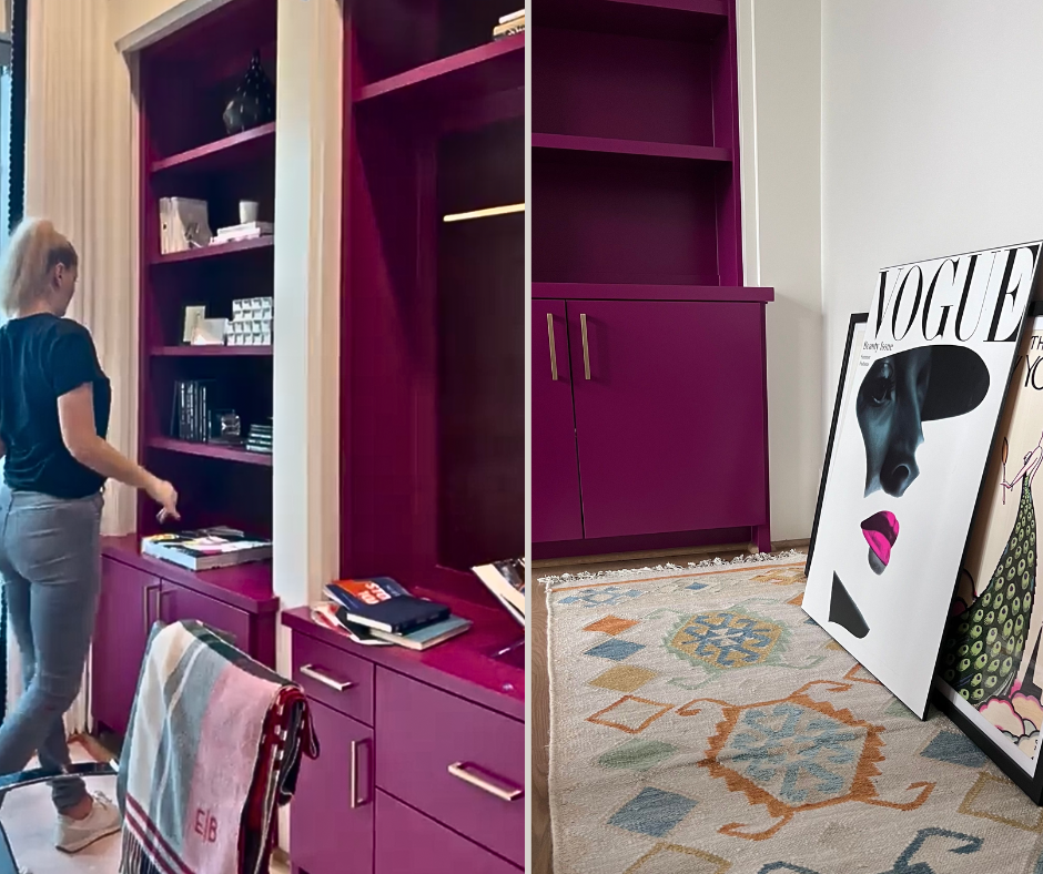
Rather than simply a fresh coat of paint across the entire space, designers included wallpaper, textiles, and more—all in one high-intensity hue. Instead of gentle versions of the trend, we saw bolder, more saturated iterations in maroon, navy, and jewel tones. From small spaces to grand interiors and from matte finish to high-gloss shine, it appears that monochrome is widening its reach with many different interpretations. Read on for our take.
First, What Is Color Drenching?
Though color drenching does imply using the same hue on both walls and ceiling, the trend encompasses a bit more than just a fresh coat of paint in one color. Instead, it is an immersive approach to color that wraps a room in depth, emotion, and visual coherence. As Architectural Digest’s Marius Thies puts it here, color drenching is “a full-on, single-hue explosion across all surfaces in a room,” extending beyond accent walls to encompass everything from ceilings and trim to upholstery and built-ins.
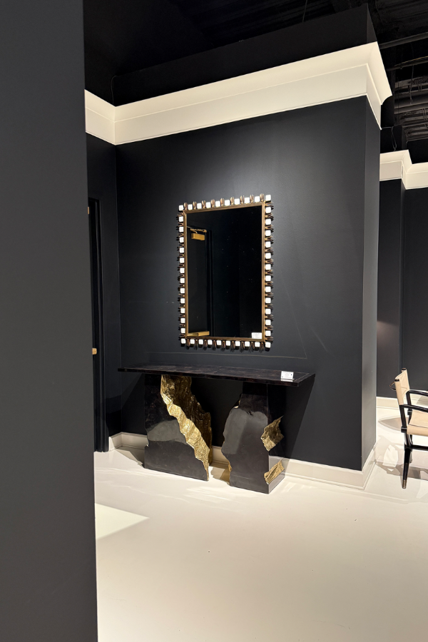
Rather than defaulting to contrast or conventional white ceilings, this year’s take on the trend feels elevated and intentional. Vogue notes the shift away from standard practice, highlighting how color drenching means “using anything but white” across ceilings, skirting boards, and even radiators for a cohesive, expressive effect.
Whether you love pink or blue, bright or dark, you can choose any hue. The paint color you select just needs to pack a punch when paired with other elements.
Fuel your creative fire & be a part of a supportive community that values how you love to live.
subscribe to our newsletter
*please check your Spam folder for the latest DesignDash Magazine issue immediately after subscription

Monochrome Doesn’t Mean Monotone!
House Beautiful’s Kelly Allen echoes that sentiment, describing color drenching as a method of saturating a space by painting “walls, trim, molding, baseboards, built-ins, and ceiling” in a single color. But monochrome doesn’t mean monotone—layering is essential. Designers often vary paint finishes (think matte walls and satin trim) or integrate texture through fabrics, furniture, and materials. As AD suggests, this trend focuses on creating visual interest, not visual overloading your clients.
Ultimately, color drenching is about saturation instead of sameness. It helps shape how a room feels—moody, serene, invigorating—using one cohesive hue across a combination of textures, features, and finishes. Try the trend in a dining room or a powder room—either way, you’ll make an impact.
Why Designers Love Color Drenching in 2025
Color drenching has become a designer favorite not just for its boldness but for its ability to completely transform how a space feels. By enveloping every surface in a single hue, designers can create an immersive, atmospheric experience—one that feels emotionally cohesive from floor to ceiling.
As with the dopamine decor trend, there’s a psychological depth to this approach. Nashville-based designer Roger Higgins told House Beautiful that “Saturated color adds ambiance and elevates the mood of a room.” Whether the goal is cocooning calm or vibrant energy, color drenching delivers by committing fully to the emotional resonance of a color.
Color Drenching as a Strategy for Your Unique Space
It’s as strategic as it is emotional. Deep, dark shades can make small rooms feel snug and cocooned, while lighter hues can stretch the eye and give an illusion of more space. By eliminating contrast between walls, ceilings, and trim, the edges of a room seem to dissolve. This effect can make the space feel larger, softer, or more serene depending on the palette.
And on a more personal level, it’s simply a joy to celebrate a favorite hue in full force. No more playing it safe with “just an accent wall.” When done well, color drenching reads as curated and confident.
Tips for Trying It with Your Clients
Color drenching may seem simple on the surface, but pulling it off with sophistication requires care—especially when guiding clients through the process. Below are a few tried-and-true strategies for making the trend feel elevated, textural, and completely tailored to the client’s aesthetic. Remember, don’t just match! Make each design decision intentional.
Choose a Color They Truly Love
Start with a hue that resonates emotionally, not just visually. Designer Jenn Feldman advises choosing colors with “a smoked-out gray or greige undertone,” noting that they’ll feel more timeless and layered. The right tone will ground a space rather than overwhelm it.
Test in Different Lights
Even a perfectly balanced color can behave differently depending on the time of day or the direction of a room’s windows. Paint generous test swatches and observe the color from morning light to evening shadows to be sure it performs consistently.
Mix Finishes for Dimension
To avoid a flat or one-note look, vary your finishes. As noted in House Beautiful, matte or flat finishes work beautifully for ceilings, while satin on the walls and semi-gloss on millwork or trim adds a subtle sheen and tactile contrast. The eye moves, even within one color story.
Play With Texture
Drenching doesn’t mean defaulting to monochrome monotony. Upholstery, rugs, case goods, and accessories should introduce different materials—glass, boucle, brushed metal, or wood—that hold the color in unique ways. These tactile contrasts add depth and make the space feel considered.
Start Small
Nervous clients? Begin in a low-stakes space. Powder rooms, closets, or home offices are ideal places to experiment with saturated palettes and finish variations. As Architectural Digest points out, “A single tone doesn’t necessarily mean monotony” and a small color-drenched room is proof of that.
Soft Color Drenching: How to Capture the Design Trend Without Committing
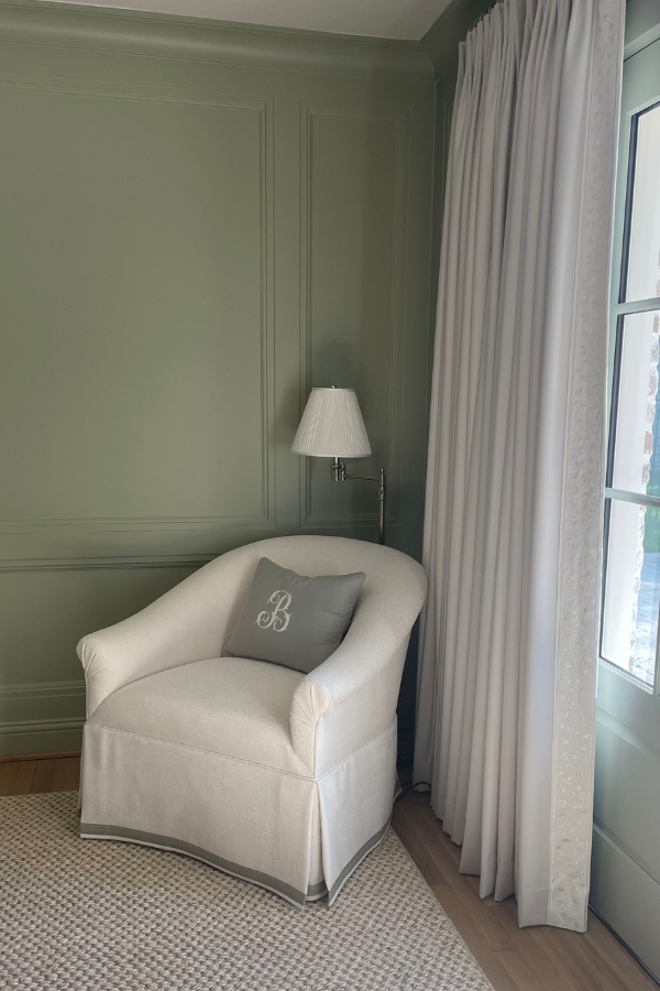
If full color drenching feels too bold for your space, a soft color drenched room might be the superior choice. Instead of saturating a room in a high-intensity hue, this approach uses muted or tonal variations of a single color—like sage green, dusty blue, or warm taupe—across walls, trim, and key accents.
Take this sage green space, for example: the monochrome walls and trim create a seamless backdrop, while soft neutrals in the chair and rug keep the room airy and approachable. Even though it doesn’t fully commit to the colour-drenching trend, this interior feels cohesive, calm, and cocooned. After all, the entire room is still painted in the same color. It’s perfect for those seeking subtle sophistication over dramatic contrast.
Final Thoughts
Executed thoughtfully, color-drenching can be a bold yet deeply intentional approach to creating emotionally resonant spaces. Whether it’s a jewel-box powder room, a saturated den, or a sage green bedroom, these monochromatic designs create mood, tell a story, and invite a sense of calm or energy depending on the hue.
Have you “color-drenched” a space for your clients? Let us know in the comments below!


