The New Black: Charcoal, Ink, and Graphite as Core Neutrals

 0
0
Summary
Charcoal, ink, and graphite are moving from accent tones to foundational neutrals, offering depth, structure, and quiet drama without overwhelming a space. These shades absorb light, enhance contrast, and pair beautifully with natural textures like wood, stone, and metal. Used thoughtfully, they can ground a room while adding a layer of intention and sophistication.
Reflection Questions
– Are you currently leaning too heavily on light neutrals in your designs, and if so, where might a deeper tone add contrast or structure?
– How could you use charcoal, ink, or graphite to frame a space or anchor a color palette without overwhelming it?
– Could these tones help define zones within an open plan or add intimacy to larger rooms that feel too airy?
Journal Prompt
Think of a recent project where you defaulted to white or light gray as a neutral base. How might it have felt with charcoal, ink, or graphite as the backdrop? Imagine how the mood, materiality, or sense of balance might shift. Would it make the space feel more collected, more dramatic, or more architectural? Describe the difference.
Call it a tonal shift, if you will. Across showrooms, studios, and recent client projects, black-adjacent hues—charcoal, inky blue, graphite—are shifting into the spotlight. Instead of appearing as accents, they are now acting as foundational neutrals.
These tones are typically more nuanced than pure black. They ground a room without closing it in; they absorb light, shape mood, and sharpen contrast, but with a softness that flat black can’t always achieve. Think of them as the new baseline: rich, structural, and surprisingly flexible.
Designers are using these shades in place of the usual whites and beiges—on cabinetry, upholstery, walls, and even ceilings. In mostly neutral spaces, they create tension and depth. In colorful rooms, stabilize.
More than anything, charcoal, ink, and graphite suggest intention and consideration because, while they don’t shout, they don’t disappear either. Let’s get into it.
Why These Shades Work Now
Neutrals have always done the heavy lifting in interiors, but for years, that often meant pale tones: soft whites, sandy taupes, greige in every shade. While those still have their place, there’s a growing appetite for depth. And that’s where charcoal, ink, and graphite seem to be moving up the ranks. We’re seeing them in wallcoverings, baseboard to ceiling paint, upholstery, and more.
These hues are less bright and more atmospheric. They don’t demand attention in a showy way, but they do command presence. In a living room, a graphite-painted wall can make furniture and lighting feel curated and collected. In a kitchen, charcoal cabinetry reads as elevated but not flashy. And in bedrooms or libraries, inky tones deliver drama (think dark academia).
They also work beautifully with today’s material palettes; imagine charcoal against white oak or graphite next to unpolished brass. These combinations create contrast without harshness. Instead of stark black-and-white, you get layered gray-on-beige, blue-black-on-cream, shadow-on-warmth. It’s less binary and more nuanced.

How to Make These “New Neutrals” Work in a Space
Deeper, darker tones can be striking, but they’re not without their challenges. Used carelessly, they can flatten a room. Used intentionally, they enhance the architecture of the space. Here’s how to work with charcoal, ink, and graphite in a way that highlights their strengths.
Balance with Texture
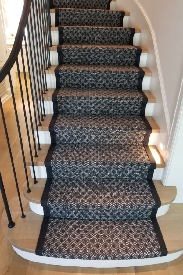
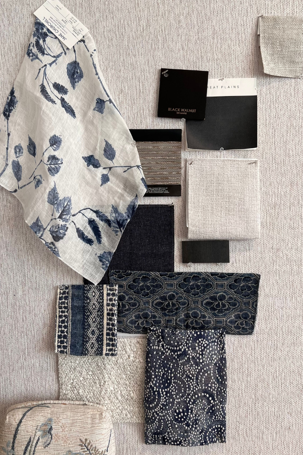
One of the most effective ways to offset the density of these deep hues is through texture. Think limewashed walls, tactile upholstery, a stunning stair runner, or unfinished wood. Even within a tight monochromatic palette, varied surfaces keep things visually engaging.
Try pairing charcoal wainscoting with a grasscloth wallpaper or layering ink-colored paint over a subtly plastered wall. These combinations allow the color to absorb light while the texture reflects it, which makes the space more dynamic.
Add Contrast with Materials and Neutrals
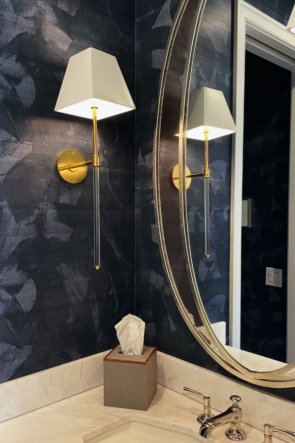
Dark tones thrive when they have something to play off of. Add contrast with a bold wallpaper, integrate beautifully executed millwork, or a mix of metals. Metals like brushed brass, aged iron, or patinated bronze are warm enough to work well with dark grays and deep blues; plus, they reflect light in moodier spaces.
You can also take the opposite approach: adding paler tones and softer textures. Even a single contrasting element—like a pale stone countertop or a blond wood floor—can keep these darker colors grounded and balanced.
Fuel your creative fire & be a part of a supportive community that values how you love to live.
subscribe to our newsletter
*please check your Spam folder for the latest DesignDash Magazine issue immediately after subscription

Use Layered Lighting
These hues absorb light by nature, which means excellent layered lighting isn’t optional. Don’t rely on a single source. Combine overhead lighting with floor lamps, table lamps, and sconces to prevent the room from falling flat. Warm bulbs (2700K–3000K) often work well with darker neutrals, but try a few exposures to ensure you strike the right balance.
Give the Color Room to Breathe
Charcoal, ink, and graphite are quietly bold. They don’t need accessories to make them interesting, but they do need space. Don’t over-clutter a room painted in these shades. Let walls or cabinetry stand on their own.
Instead of filling every corner, consider where the color can speak for itself and where a little restraint can underscore its depth. As in this minimalist yet impactful bath designed by Staci Munic Interiors, black accents perfectly complement the white walls, wooden vanity, and gold finishes without an excess of design elements.

Final Thoughts on Darker Shades as Core Neutrals
Charcoal, ink, and graphite may not be new colors, but their role in interiors is definitely evolving. Instead of functioning solely as accents or statement walls, they are now the foundation upon which more complex, layered spaces are built. These deep, atmospheric tones create a sense of permanence and sophistication that lighter neutrals might not match.
Let us know how you design with darker shades in the comments below.

Related Posts

Retro-Futurism Revisited: How Y2K Aesthetics Are Making a Design Comeback
Rediscover the playful, over-the-top Y2K aesthetic as it makes a bold

Women, In Their Own Words: Paulina Hospod
Enjoy insights from Paulina Hospod of AhA!nteriors in our “Women, In

How to Clean Solid Gold and Gold-Plated Jewelry at Home
Our step-by-step guide will show you how to clean gold jewelry with ge

Back to School: Where Can I Study Interior Design in California?
From SDSU to Otis College of Art and Design, these California interior
Green Planning of Public Spaces: Integrating Nature in Urban Environments
Let's consider the transformative impact of green cities, examining th