We Still Love Pattern Mixing in Maximalist (& Minimalist) Interiors

 12
12
Summary
Pattern mixing may not be as sleek or controlled as the trendier “pattern drenching,” but it remains a design essential for those who want layered, personal interiors that tell a story. By balancing scale, colour, texture, and pattern type, designers can craft spaces that feel curated, not chaotic. The seven rooms featured here prove that when done with intention, mixing patterns adds richness, warmth, and a clear sense of personal style.
Reflection Questions
Which types of patterns do I naturally gravitate toward—bold geometrics, organic florals, playful illustrations—and how could I push that comfort zone with contrast or scale?
How might I use pattern to bring more dimension or narrative into a space that currently feels flat or too uniform?
In my own work, am I using pattern to reflect my client’s personality—or simply to match a palette or style? How can I be more intentional?
Journal Prompt
Write about a time you successfully (or unsuccessfully) mixed patterns in a space. What worked? What didn’t? Looking back now, how would you adjust the mix—through scale, colour, material, or type—to better reflect the room’s mood or the user’s personality?
You’ve heard of “pattern drenching.” According to House Beautiful’s Kate McGregor, “Pattern drenching creates a monochromatic look, similar to color drenching, but with a print rather than a solid color.” Designers love it because it’s less busy than pattern mixing, but we feel that it can look a bit over-curated. While perfect for hotels, it might not have the layered look we love in personal spaces. Plus, pattern mixing is more versatile than pattern drenching, which McGregor admits “is best used in rooms with minimal architectural details.” In defense of pattern mixing—not just “pattern drenching”—, here are a few spaces that do it particularly well. (Some were designed by DesignDash Community members!)
In Defense of Pattern Mixing: Why It (Almost) Always Works
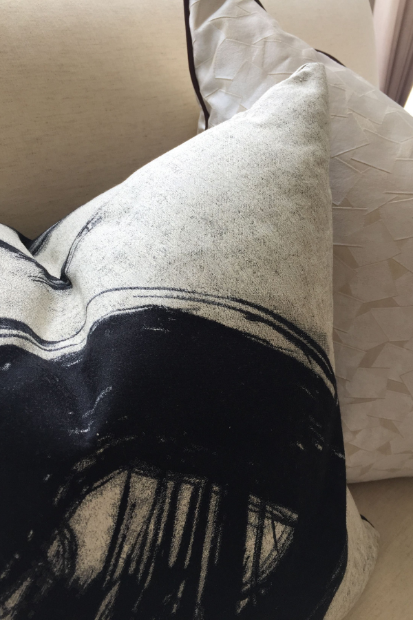
Pattern drenching may be a trend, but pattern mixing certainly isn’t. Where pattern drenching prioritizes uniformity, mixing patterns plays with contrast, scale, and colour in a way that feels layered and lived-in. Designers might look to bold patterns like stripes, florals, geometric prints, and even animal prints to build a dynamic palette that ties a room together without making it feel chaotic. These patterns might be saturated in color or they might all be neutral.
The key is to create balance by mixing scales (think small scale florals with large scale geometric patterns), aligning complementary colors, and using texture (like wood grain or other fabrics) to ground the overall interior design. This way, you add interest without overwhelming the space. A clean-lined sofa in a solid colour might sit next to an armchair upholstered in mixed prints, all of it tied together with a rug that picks up shapes and shades from both.
Mixing pattern types (organic patterns with geometric ones, or structured stripes with softer, more fluid forms) is a bit like styling your current wardrobe. Find what matches you, not just what matches. Whether you’re working with a tight colour palette or have been granted full maximalist freedom, mixing patterns allows your client’s personal style to shine through.
If you’re trying to create a space infused with your client’s confidence and character, skip the overly curated, matchy-matchy look. Not sure where to start? Below are seven interiors that make mixing pattern scales, styles, and colors look easy yet elevated.
Fuel your creative fire & be a part of a supportive community that values how you love to live.
subscribe to our newsletter
*please check your Spam folder for the latest DesignDash Magazine
Seven Interiors That Make Mixing Patterns Look Like an Art Form
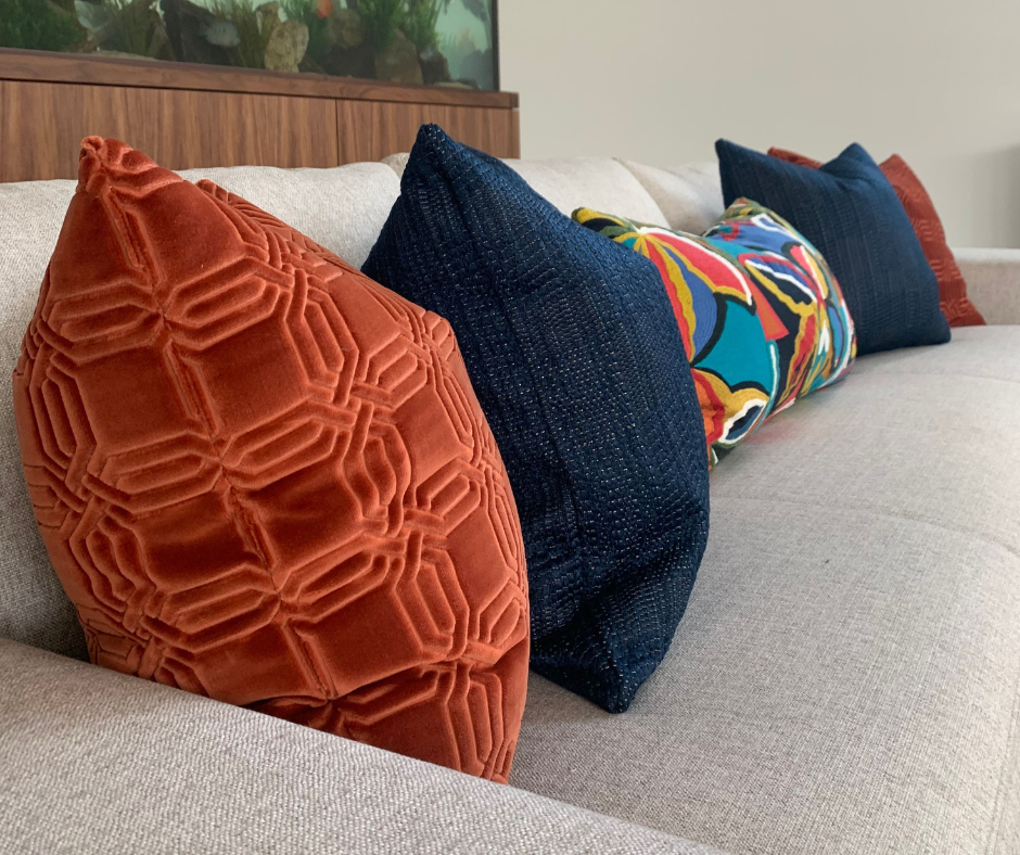
#1 This Joyful Bedroom by Rebecca Hughes Interiors
Rebecca Hughes Interiors shows exactly how to layer pattern with confidence and charm in this bright, inviting bedroom. A petite floral wallpaper in navy and rust sets the tone by establishing a soft, organic base for bolder moments to follow.
The curtains introduce a graphic, large-scale print in a coordinating rust tone, which we feel is proof that mixing scales is key to keeping the overall look balanced. On the bed, that pattern play continues: a woven lumbar cushion in structured stripes, smaller-scale animal print bolsters, and a statement throw with stylized creatures in the same blue-white pattern.
Even the rug joins in with a zigzag motif that echoes the palette while introducing an unexpected post-modern feel. While there are many different patterns in this space, it feels curated instead of fussy.
#2 This Home Office Vignette from TKS Design Group
TKS Design Group nails the art of subtle pattern play in this home office, which was part of their Tudor Transformation project. The built-in bench seat features a classic plaid cushion in soft neutrals with a navy stripe.
Throw pillows layer in small-scale woven patterns in muted pinks and dusty blues, while the surrounding wallpaper adds rhythm and surprisingly masculine energy with its grid of warm-toned studs against textured grey. We feel that these choices demonstrate how patterns don’t always need to shout to add interest; sometimes it’s the softer, tighter scales that make the greatest impact.
This space proves that mixing patterns can still feel calm and intentional, especially when everything shares a coherent color palette and a tactile sensibility.
#3 This Mod Bedroom by Staci Munic Interiors
Staci Munic Interiors brings a clean, sun-drenched approach to pattern layering in this airy guest bedroom. What could feel flat in a neutral scheme is instantly more dimensional thanks to thoughtful use of repetition and differing scale.
The eye is immediately drawn to the oversized octagonal pattern behind each bed. These sculptural headboards beautifully compliment the textiles and tonal wallcovering. From there, more subtle patterns add interest: foliage motifs on the duvets, mod pillow covers, and woven throws at the foot of each bed introduce just enough colour and contrast.
Perhaps the most unique choice in this space is actually those textural pillows. Its graphic circular shapes soften the otherwise linear language of this space, ensuring it feels like a true Palm Springs sanctuary.
#4 This Jewel-Toned Interior by Laura U Design Collective
Laura U Design Collective takes a fearless approach to color and pattern in this vibrant Houston high-rise. The Alta wallcovering by Lindsay Cowles is a shocking, stunning, and almost psychedelic focal point. Its kaleidoscopic swirl of jewel tones transforms a transitional bar nook into something theatrical and expressive.
The bold pattern is mirrored and repeated across the wall, and its fluid, abstract shapes actually soften the angularity of the mirror’s Moroccan-inspired frame. Paired with velvet bar stools in saturated sapphire and a lacquered cabinet with sculptural black hardware, the mix feels both polished and playful.
#5 This Charming Dining Room by Aveon Designs
Whimsical and sophisticated? Yes, it can be done! Aveon Designs embraces quirkiness without losing an ounce of elegance in this refreshingly layered dining room. Of course, the star of the show is Hutch wallpaper by Hunt Slonem for Lee Jofa. A playful, sketch-like repeat of abstract bunnies, this wallcovering reads graphic rather than cutesy thanks to its monochrome palette and tight pattern scale.
To balance the black-and-white walls, Vyara Johnson brought in grounding element, which include a traditional Persian-style rug underfoot in deep rust and navy and classic dining chairs upholstered in pale blue velvet with dark wood frames. The navy curtain panel introduces another layer of pattern, this time in a painterly, dappled print.
We feel this is a great example of how to mix high-contrast patterns from entirely different style families—traditional, illustrative, and organic—and still produce a cohesive result. It’s fun, elevated, and confident. View the stunning space here.
#6 This Beautiful Living Space by Annie Golliher of Storied Interiors
Perhaps the most boldly layered space in this list, this living room vignette by Annie Golliher delivers a maximalist moment that feels deeply rooted in narrative and nostalgia. The wallpaper’s bold vertical pattern composed of coral, ochre, and teal establishes a retro palette that feels both joyful and grounded.
From there, pattern mixing occurs in layers. The speckled upholstery on a rolled-arm loveseat introduces texture without veering into chaos, while a black-and-white dotted pillow adds graphic pop. The green embroidered cushion brings in a completely different pattern type—ornamental and earthy—yet it doesn’t feel out of place. We think the secret here is palette discipline and contrast control.
Nothing feels matchy, but everything feels meaningful.
#7 This Stunning Tudor Transformation by TKS Design Group
TKS Design Group brings cinematic drama to this dining room with a panoramic mural, rich jewel tones, and unexpected pattern. Rendered in earthy rusts, ochres, and deep greens, this wallcovering is completely immersive.
Pattern mixing here is subtle but impactful. The green velvet dining chairs introduce texture and depth, while their plaid fabric backings provide a classic counterpoint to the sweeping mural. We feel that this moment—mixing a more tightly scaled traditional print with a grand illustrative scene—is what makes the room so unique.
Tiers of gold lighting and sculptural sconces give an otherwise horizontally oriented space verticality, echoing the warm tones of the wallcovering without competing. TKS shows us how to work with bold, oversized patterns without letting them dominate the entire space.
Written by the DesignDash Editorial Team
Our contributors include experienced designers, firm owners, design writers, and other industry professionals. If you’re interested in submitting your work or collaborating, please reach out to our Editor-in-Chief at editor@designdash.com.
Fuel your creative fire, thrive with support from peers, & make 2025 your firm’s best year yet!
JOIN THE DESIGNDASH COMMUNITY
Related Posts

Here Are 5 Incredible Interior Design Programs in Minnesota
If you plan to become one of Minnesota’s many successful interior de
Elegant Modernism: Who Was Pietro Belluschi?
Join us as we explore the impact of Pietro Belluschi's forthright yet
Retro-Futurism Revisited: How Y2K Aesthetics Are Making a Design Comeback
Rediscover the playful, over-the-top Y2K aesthetic as it makes a bold
Why a Mastermind? The Value of Peer Advisory Groups in Our Competitive Industry
Curious about joining a DesignDash Mastermind? Learn all about the man
Our Favorite Winter & Fall Candles to Make Your Home Smell Amazing
Warm up your space with our favorite winter and fall candles. From ric
What Is Desert Modern Design? Exploring the Palm Springs Style
Desert Modern’s longevity comes from discipline: fewer finishes, bet