Seven Floral Interiors to Help You Welcome Spring

 2
2
Summary
Across projects by Callie Blanks, French & French Interiors, Danielle Balanis Design, Maddux Creative, Mary Orton, Emma Ainscough, and Martina Mondadori, florals are used in very different ways: across ceilings, on drapery, in friezes, on upholstery, and sometimes across nearly every surface in the room. What links them is not a single style but a certain level of commitment. These designers use floral pattern to shape atmosphere, adjust scale, and deepen a room’s identity rather than merely soften it.
Reflection Questions
How much floral pattern feels right to you in a room before it starts to feel overworked?
Which approach in this article feels most convincing: florals used sparingly in one element, or florals repeated across walls, fabric, and trim?
When you respond to a floral room, are you reacting more to the pattern itself, or to the other materials around it such as wood tones, tile, painted millwork, or metal finishes?
Journal Prompt
Think about a room you have loved for a long time, whether it was your own, someone else’s, or one you have only seen in photographs. Was there a pattern in it that shaped the room more than you first realized? Write about where that pattern appeared, what materials surrounded it, and why it worked. Then consider whether the room would have felt flatter, colder, or less specific without it.
From fashion to interiors, we’ve heard it said so many times that many of us audibly groan when “Florals for Spring? Groundbreaking!” finds its way into every article’s seasonal standfirst. Floral decoration has always had a complicated reputation in interior design. Done poorly, it can feel overly sweet, nostalgic, or dustily historic. Done well, it introduces movement, texture, and a freshness that very few patterns can replicate.
The interiors below depict how designers are working with florals across wallpaper, upholstery, drapery, and architectural surfaces. Some use the motif sparingly while others let it overtake them completely, covering entire rooms in pattern and building the design outward from there. From a Santa Fe bathroom layered with checkerboard tile and botanical wallpaper to a London living room where saturated color surrounds Victorian florals, these interiors show that there are myriad ways to incorporate flowers without suffering its clichés.
Seven Floral Interiors to Help You Welcome Spring
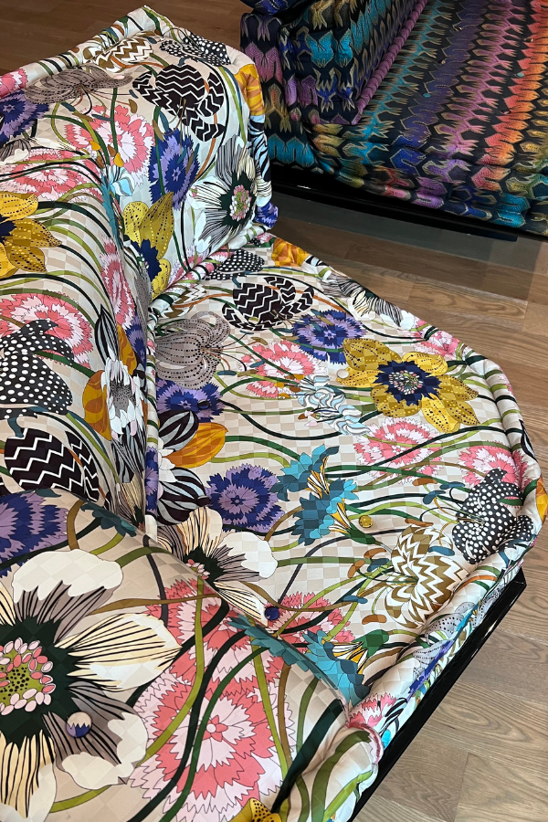
Callie Blanks Interiors’ Country Estate Project
Callie Blanks worked floral pattern into several rooms of her Country Estate project, but each space employs it differently. In the dining room, a blue-gray floral wallcovering sits behind a dark wood table and thick upholstered chairs, while a scallop-fringe chandelier drops low over the surface and changes the tone of the whole room. In the bedroom, floral drapery frames the canopy bed and repeats in a more restrained way against pale walls and a dusty rose bed frame. Then in the sitting room, the floral note is more concentrated rather than spread across the envelope. That variation adds dynamism while keeping the entire home cohesive, romantic, and absolutely beautiful.
Blanks describes the Fulshear home as “blending traditional architecture with a relaxed, modern approach to country living.” That description is entirely accurate, especially in the rooms pictured above. The dining room has weight and polish, the bedroom feels softer, and the sitting room pulls things inward with paneling, textiles, and a more private atmosphere. Callie Blanks Interiors often works with vintage and collected pieces, rich materials, and custom details, and this project shows how that approach can keep floral decoration from feeling sweet or overdone. A member of the DesignDash Community, Blanks excels at creating rooms that feel personal, elevated, and usable at the same time.
Danielle Balanis Design’s Kips Bay Show House Bedroom
Danielle Balanis Design covered this Kips Bay bedroom in a brown floral textile that wraps the walls, the ceiling, the upholstered seating, and the bed canopy. It is dense, immersive, and a little excessive in the best possible way. The pale blue lining inside the canopy and the matching bedcover keep the room from going visually flat, and the white bed frame gives the eye a cleaner outline to hold onto. Small blue-and-white ceramics on the wall reinforce the palette, while the carved wood tables and leopard accent pillow keep the room from feeling purely pretty.

That sort of all-in decorating makes sense in the context of Kips Bay. According to the show house organization, the 2026 Palm Beach edition spans two properties for the first time, with designers reimagining rooms across both residences as part of the annual fundraiser for the Kips Bay Boys & Girls Club and the Boys & Girls Clubs of Palm Beach County. A show house room need not behave like an everyday primary bedroom. Balanis’s room grabs your attention and never lets go, just like an iconic interior in a riveting show house should. The florals are traditional, but the total effect is closer to stagecraft, which is part of why this room is memorable.
French & French Interiors’ Primary Bathroom
Heather and Matt French pasted a floral wallcovering above a dark-green-and-off-white checkerboard tile, surrounded by several paler green tones throughout the vanity, millwork, and drapery. With floral motifs climbing up the wall and onto the ceiling like vines, the paper is airy but a little old-world, with a lattice structure that keeps the flowers from feeling too precious. Below it, the checkerboard tile is cool and almost modern. The brass sink fittings and sconces warm everything back up.
That taste of freedom comes through, but the room still feels controlled. The palette is restrained, but the mix of textures is interesting enough without a bold mix of colors. Beyond the unique floral wallpaper, we particularly love the skirted pillow on the carved wooden chair, the glowing brass hardware, and framed picture window.
French & French Interiors has built a reputation for this type of layered pattern work. Founded in 2015 by husband-and-wife team Heather and Matt French and based in Santa Fe, the firm often mixes folk-inspired motifs, saturated color, and traditional craft in ways that feel personal rather than decorative for decoration’s sake. Heather leads the studio’s creative direction with a strong instinct for color and storytelling, while Matt brings a builder’s perspective that keeps the work grounded in construction and fabrication.
Maddux Creative’s Bedford Park Living Room
Scott Maddux and Jo leGleud filled this London living room with orange upholstery, green paneling, stained glass, and a floral frieze running high along the walls. What keeps it from feeling chaotic is the order of the room itself. The paneling divides the walls into measured sections, the floral border stays contained near the ceiling line, and the furniture is perfectly scaled. The orange velvet seating is unique, and so is the sculptural wood console at the back of the room. Then the stained-glass doors pull in reds and greens again, only in sharper, brighter notes.

In an Architectural Digest feature from December 2025, Scott Maddux said of the house, “The house really is a kind of celebration of color, but at the same time, it also has this historic soul that pervades most aspects of it.” The floral material here is not limited to upholstery or wallpaper in the expected places. It is worked into the upper walls in a way that speaks directly to the Arts and Crafts identity of the house. In that same feature, Jo leGleud described one wallpaper choice as “a very typically Victorian way to use wallpaper,” which helps explain why the room feels bold without losing its footing. Maddux Creative built a reputation on strong color decisions, and we can see why.
Mary Orton’s Schumacher Bedroom
Mary Orton took Schumacher’s Ariana Floral Stripe and committed to it fully. The fabric wraps the walls, covers the drapery, and returns on the bed, which gives the room a pleasing kind of repetition. The floral stripe itself has an old-fashioned prettiness, though the room around it keeps that prettiness under control. The four-poster bed is thick and angular, painted in a dusty rose that relates to the textile without disappearing into it. The chandelier has a heavier, older profile. The bench at the foot of the bed is plain and upholstered in a muted neutral. Those decisions matter, because they stop the room from tipping into excess.
Fuel your creative fire & be a part of a supportive community that values how you love to live.
subscribe to our newsletter
*please check your Spam folder for the latest DesignDash Magazine issue immediately after subscription

In an Instagram caption from 2025, Orton wrote, “A few years ago, I locked eyes with Schumacher’s Ariana Floral Stripe fabric across a crowded sample room and let’s just say, sparks flew.” She also called the room “a full-blown love letter to the fabric that started it all.” That sort of enthusiasm is obvious in the resulting space, though the room still feels thought through. Orton is known primarily as a founder, entrepreneur, and style publisher, but this bedroom makes a solid case for her decorative instincts too. It has conviction. And maybe that is why it works. She did not hedge the floral decision or water it down halfway through.
Emma Ainscough’s Powder Room
Featured in Homes & Gardens and AD, Emma Ainscough’s Clapham Family Home powder room is small, but it has far more personality than most petite interiors. The blue floral paper covers the walls right up to the blue-painted ceiling, and beneath it a sky-blue-and-white checkerboard tile wraps the lower half of the room. The sink is compact and old-fashioned, with exposed plumbing and brass fittings that feel sharper against all that cool color. Then there is the shell-framed mirror, which adds a slightly eccentric note without pulling the room off course. This powder bath is lively and layered, though still compact enough to feel intimate.
Ainscough describes her work as creating “authentic interiors which provide a playful & stimulating backdrop to everyday life,” and that phrase fits this room unusually well. Based in London, she often builds spaces that mix practical planning with pieces that feel a bit personal, a bit unexpected. This powder room does that. It has pattern, gloss, metal, and a very clear point of view, but it still feels like a real room somebody uses. The room has personality, yet none of it feels performative.
Martina Mondadori’s Casa Cabana Living Room
Martina Mondadori’s living room at Casa Cabana uses floral decoration in the way Cabana has always done best, which is generously and without much fear of clutter. The walls are painted a pale green and finished with a dense floral frieze near the ceiling, and that upper band changes the whole room. It draws your eye upward and adds detail to what could have been a fairly formal envelope. Then the furniture brings in a completely different mood. The peach velvet seating is low, rounded, and plush. The bronze-toned console at the back wall has a sculptural strangeness to it. Nothing matches neatly, but everything belongs.
In a Vogue feature from February 2024, Ian Malone described Casa Cabana as a home where “everywhere one looked offered inspiration and elegance.” He also noted that “the jubilant patterns and whimsical colors delighted the eye.” Mondadori’s world has always valued layered decoration, faded books, old textiles, and rooms that feel inhabited rather than polished into silence. Casa Cabana gives you that immediately. The floral border, the stained glass, the softened upholstery, and the oddness of the objects all help. It is floral, yes, but not fresh-cut and pretty. It is older, denser, and more interesting than that.
Written by the DesignDash Editorial Team
Our contributors include experienced designers, firm owners, design writers, and other industry professionals. If you’re interested in submitting your work or collaborating, please reach out to our Editor-in-Chief at editor@designdash.com.
Related Posts

Light, Color, and Craftsmanship: How is Stained Glass Made?
From the towering cathedrals of medieval Europe to contemporary buildi
Keep Austin Weird, But No More Windowless Bedrooms!
Can anyone who enjoys fresh air, stunning views, and preparing for the
Get Ahead of These Common Interior Design Problems with Advice from Laura U
Laura shares her insights about the most common challenges designers f

A Collection of the Most Iconic Painted Ceilings of All Time
This collection highlights the most iconic painted ceilings from aroun
Easy DIY Halloween Decorations Using Items You Already Own
From a melted Wicked Witch to cotton spiderwebs, create a festive atmo
We Need to Know: How Do You Feel About the Draped Slipcover Trend?
The draped slipcover trend is back, but is it a slouchy design stateme