
Color Theory for Artists: How Different Disciplines Apply Color Theory to Their Work

 0
0
Summary
Reflection Questions
Journal Prompt
Color theory—an essential framework within the realm of art and design—refers to the study of color as a medium of expression, communication, and influence. This theory—underpinning the creative and functional use of color—holds immense importance in shaping visual experiences and conveying messages in various art forms—including painting, graphic design, and interior design. In this article, we delve into the nuances of color theory—examining its fundamental concepts and exploring how these principles are uniquely interpreted and applied across different artistic disciplines. By providing an in-depth look at the multifaceted role of color in art and design, we will offer a comprehensive understanding of color’s power and versatility as a tool for creativity and communication.
Basic Principles of Color Theory
The Color Wheel: Understanding Primary, Secondary, and Tertiary Colors
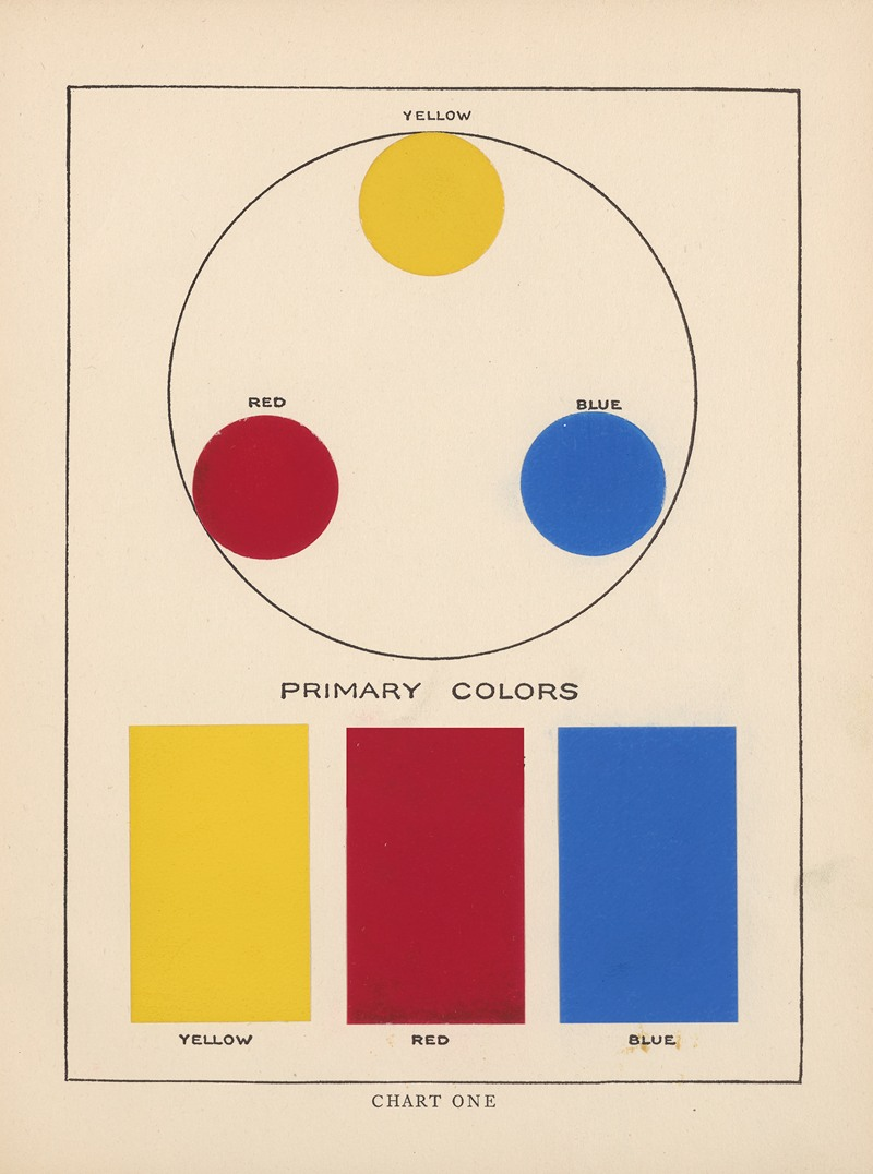
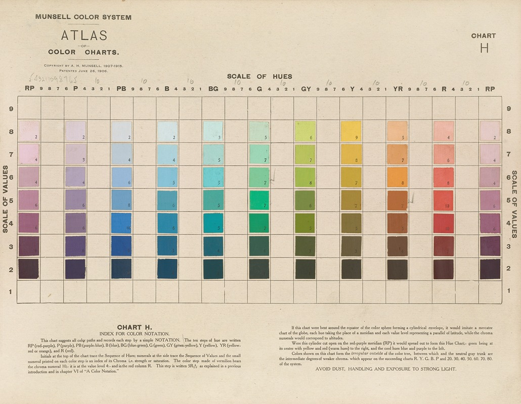
Let’s begin with primary and secondary colors. The color wheel—a fundamental tool in color theory—presents a logically arranged sequence of colors. At its core lie the primary colors—red, blue, and yellow —which cannot be created by mixing other colors. When primary colors are combined, they yield the secondary colors: green, orange, and purple.
Further blending of primary and secondary colours results in tertiary colors—like blue-green or red-violet, adding complexity and depth to the wheel. This circular representation of colors helps in understanding the relationships between colors and is a cornerstone for creating color harmony in art and design.
Color Harmonies: Complementary, Analogous, and Triadic Schemes
Color harmonies are methods to create visually appealing color schemes. Complementary colors are directly opposite each other on the color wheel—such as blue and orange—and offer high contrast and vibrant look when used together. Interior designers might opt for a complementary color scheme when crafting a space.
Analogous colors are next to each other on the wheel—like green, blue-green, and blue. This scheme provides a more harmonious and less contrasting look. Triadic schemes involve three colors evenly spaced on the color wheel—such as red, yellow, and blue—offering a balanced yet dynamic palette. Understanding these harmonies is crucial for artists and designers to create aesthetically cohesive works.
The Role of Hue, Saturation, and Value/Luminance in Color Selection
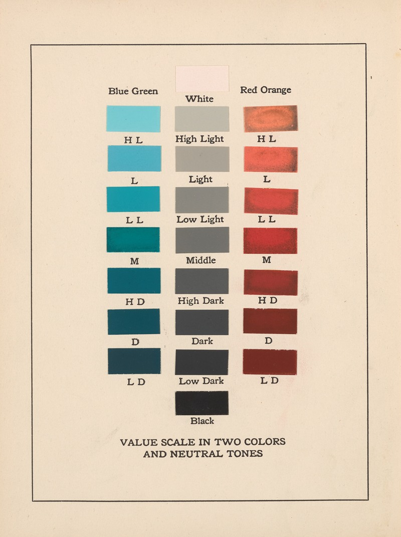
Hue, saturation, and value are critical components in selecting and manipulating colors. Hue refers to the pure spectrum colors commonly referred to by their color names like red, blue, or yellow. Saturation describes the intensity or purity of a color. The less saturation a color has, the more gray or muted it appears.
Value—or luminance—refers to the brightness or darkness of a color, independent of its hue. Adjusting these elements allows artists to convey different moods and atmospheres in their work—making color a powerful and versatile tool in their creative arsenal.
Brief Overview of the Psychological and Cultural Implications of Color
Color has significant psychological and cultural connotations that artists and designers must consider. Psychologically, colors can evoke certain emotions. For example, blue and other cool colors often induce calmness, while red and other warm colors can elicit feelings of passion or urgency.
Culturally, colors can carry different meanings. For instance, white is associated with purity in some cultures, but with mourning in others. Understanding these associations is crucial for artists and designers to communicate effectively and sensitively with their audience—ensuring their work resonates as intended across different cultural contexts.
While many of our cultural assignments of emotion to different colors come from our interactions with nature, warm and cool colors might mean something completely different from one culture to the next.
Color Theory in Painting
The Painter’s Palette: Choosing and Mixing Colors
Traditional vs. Contemporary Approaches
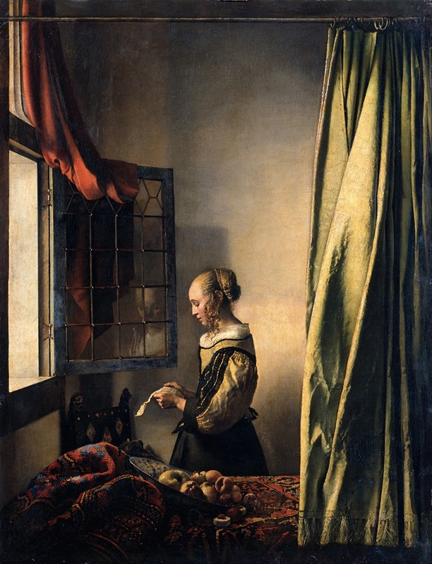
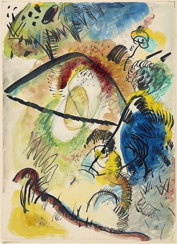
In traditional painting, color selection and mixing were guided by available pigments and the desire to achieve naturalistic representations. Artists like Rembrandt and Vermeer were known for their restrained palettes and mastery in creating depth and realism. Contemporary approaches—however—often break these conventions.
Artists like Mark Rothko and Yayoi Kusama use color to evoke emotion or create immersive experiences—often employing vibrant, unconventional palettes. The shift from representational to expressive use of color marks a significant evolution in the application of color theory in painting.
Impact of Different Mediums (Oil, Acrylic, Watercolor)
The medium plays a crucial role in how color is perceived and applied. Oil paints—with their rich texture and prolonged drying time—allow for subtle blending, creating depth and luminosity. Acrylics—being water-soluble and quick-drying—are versatile for both opaque and transparent effects, suitable for bold and layered applications.
Watercolors—known for their translucency—demand a delicate balance of water and pigment—resulting in ethereal and fluid color transitions. Each medium inherently affects the intensity, texture, and overall impact of color in artwork.
Color in Composition and Mood Setting
Historical Examples and Their Use of Color
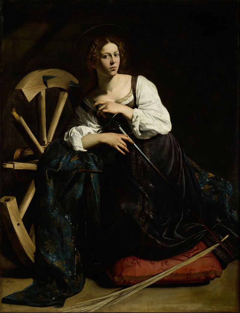
Throughout history, artists have used color to enhance composition and set the mood of their paintings. The Renaissance period saw the use of chiaroscuro by artists like Caravaggio—who used stark contrasts between light and dark colors to create dramatic tension.
The Impressionists like Claude Monet shifted to lighter palettes to capture the fleeting effects of light and atmosphere. In each era, the use of color reflects not just aesthetic preferences but also philosophical and cultural underpinnings of the time.
Color Symbolism and Emotional Connections
Color symbolism plays a pivotal role in conveying emotional depth in paintings. For instance, blue often symbolizes tranquility or sadness, while red can signify passion or danger. This symbolic language of color allows painters to create a deeper emotional connection with the viewer.
Frida Kahlo’s use of vibrant colors in her self-portraits—for instance—communicates intense emotional and physical pain. Understanding these symbolic and emotional connections enables painters to use color not just as a visual tool but as a means of storytelling and emotional expression.
Color Theory in Graphic Design
Digital Color: RGB and CMYK Models
The realm of graphic design primarily operates with two color models: RGB (Red, Green, Blue) for digital screens and CMYK (Cyan, Magenta, Yellow, Key/Black) for print. RGB, which is used in electronic devices like computers and TVs, mixes light to create colors—making it ideal for designs displayed on screens.
Its vast spectrum allows for vibrant and diverse color representation. In contrast, CMYK is a subtractive model used in printing. It works by layering inks to absorb light—thus reducing its reflection and creating colors. This model is more restrictive compared to RGB—often posing a challenge in accurately replicating colors from digital designs in print.
Effective Use of Color in Visual Communication
Branding and Identity Design
In branding and identity design, color is a powerful tool for creating memorable and recognizable identities. It’s essential in conveying a brand’s personality. For instance, blue often conveys professionalism and trustworthiness—making it a popular choice in corporate logos.
Brands like Coca-Cola and McDonald’s effectively use distinctive color schemes to enhance brand recognition. A thoughtful approach to color selection can significantly impact how a brand is perceived and remembered.
User Interface and User Experience Considerations
Color in user interface (UI) and user experience (UX) design goes beyond aesthetics. It plays a crucial role in functionality and usability. For example, contrasting colors can enhance readability and navigability, while a harmonious color scheme can create a pleasant user experience.
Accessibility is also a key consideration. Color choices must accommodate color vision deficiencies—ensuring that information is accessible to all users. The strategic use of color can guide user behavior, emphasize important elements, and improve overall interaction with the product.
Challenges of Color in Digital vs. Print Media
The transition of colors between digital and print media presents notable challenges. Colors that appear vibrant and clear on a digital screen can lose their intensity and clarity when printed. This disparity is due to the inherent differences between the RGB and CMYK color models and the varying capabilities of print and screen technologies.
Graphic designers must navigate these differences—often through color adjustments and proofs—to ensure color consistency and accuracy across both mediums. This process requires a deep understanding of color theory and its application in diverse formats—emphasizing the importance of color knowledge in effective graphic design.
The Theory of Color in Photography
Understanding Color in Light and Shadows

In photography, the interplay of light and shadows fundamentally shapes the color dynamics within an image. Light quality—whether it’s the soft diffused light of an overcast day or the harsh direct light of midday sun—drastically affects how colors appear. Photographers must understand how different lighting conditions influence color temperature and saturation.
For instance, golden hour light brings warm tones, enhancing the colors’ richness, while a cloudy sky can mute colors, giving a more subdued feel. Shadows—on the other hand—aren’t just the absence of light but can subtly reveal color nuances—adding depth and complexity to the image.
Post-Processing: Color Grading and Balance
Post-processing in photography is a critical stage for color theory application. Color grading—the process of altering and enhancing the color of an image—allows photographers to set a specific mood or style. It involves adjusting various aspects like hue, saturation, and luminance to achieve the desired aesthetic.
Balancing colors is also crucial in post-processing, which includes correcting color casts or uneven lighting. This stage is where the photographer’s vision comes to fruition—with the power to transform the emotional impact of an image through color manipulation.
The Role of Color in Setting the Tone and Narrative of Photographs

Color is a powerful storytelling tool in photography. It can convey emotions, create atmosphere, and even guide the viewer’s attention within the frame. For instance, a photograph with a predominantly blue palette might evoke feelings of calmness or melancholy, while vibrant, contrasting colors can convey energy and excitement.
Photographers often use color to draw focus to specific subjects or to lead the viewer’s eye through a composition. Additionally, the use of color can provide contextual clues—setting the scene’s time, place, and mood. Understanding and manipulating color allows photographers to create not just visually striking images but also ones that resonate emotionally and narratively with the viewer.
Color Theory in Sculpture and 3D Art
Material-Based Color Considerations
In sculpture and 3D art, the choice of materials inherently influences color considerations. Different materials—be it bronze, marble, wood, or modern synthetic compounds—come with their intrinsic color characteristics.
For instance, the natural hues of wood or stone can impart a warm, organic quality to a piece, while metals can offer a range of reflective properties and patinas. Sculptors must understand how the texture, sheen, and color of their chosen materials interact with light and influence the overall perception of color in their work.
Color in Environmental Interaction and Display
The environmental context in which a sculpture is displayed plays a significant role in how its colors are perceived. External factors like natural light, artificial lighting, and surrounding colors can dramatically alter the appearance of a sculpture.
For instance, a sculpture displayed outdoors will have a different color interaction throughout the day and across seasons, compared to one housed under controlled lighting in a gallery. Sculptors often consider these environmental aspects when choosing colors—ensuring that their work maintains its intended visual impact in various settings.
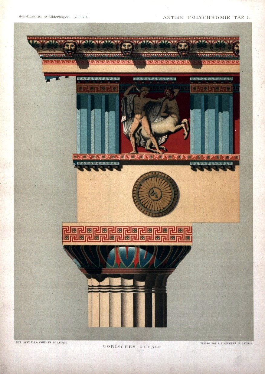
Historical and Modern Examples of Colored Sculpture
Historically, color in sculpture has traversed a diverse range of styles and periods. Ancient Greek and Roman sculptures—once thought to be pristine white marble—were actually vibrantly painted—a practice that reveals the historical importance of color in enhancing realism and symbolism.
In contemporary sculpture, artists like Jeff Koons and Anish Kapoor utilize color to create impactful, sensory experiences. Koons’ reflective, brightly colored works play with the viewer’s perception of space and form, while Kapoor’s use of pigment and reflective surfaces manipulates color to challenge the viewer’s perception of depth and scale.
These examples underscore how color remains a dynamic and integral component of sculpture and 3D art, from historical realism to modern abstraction.
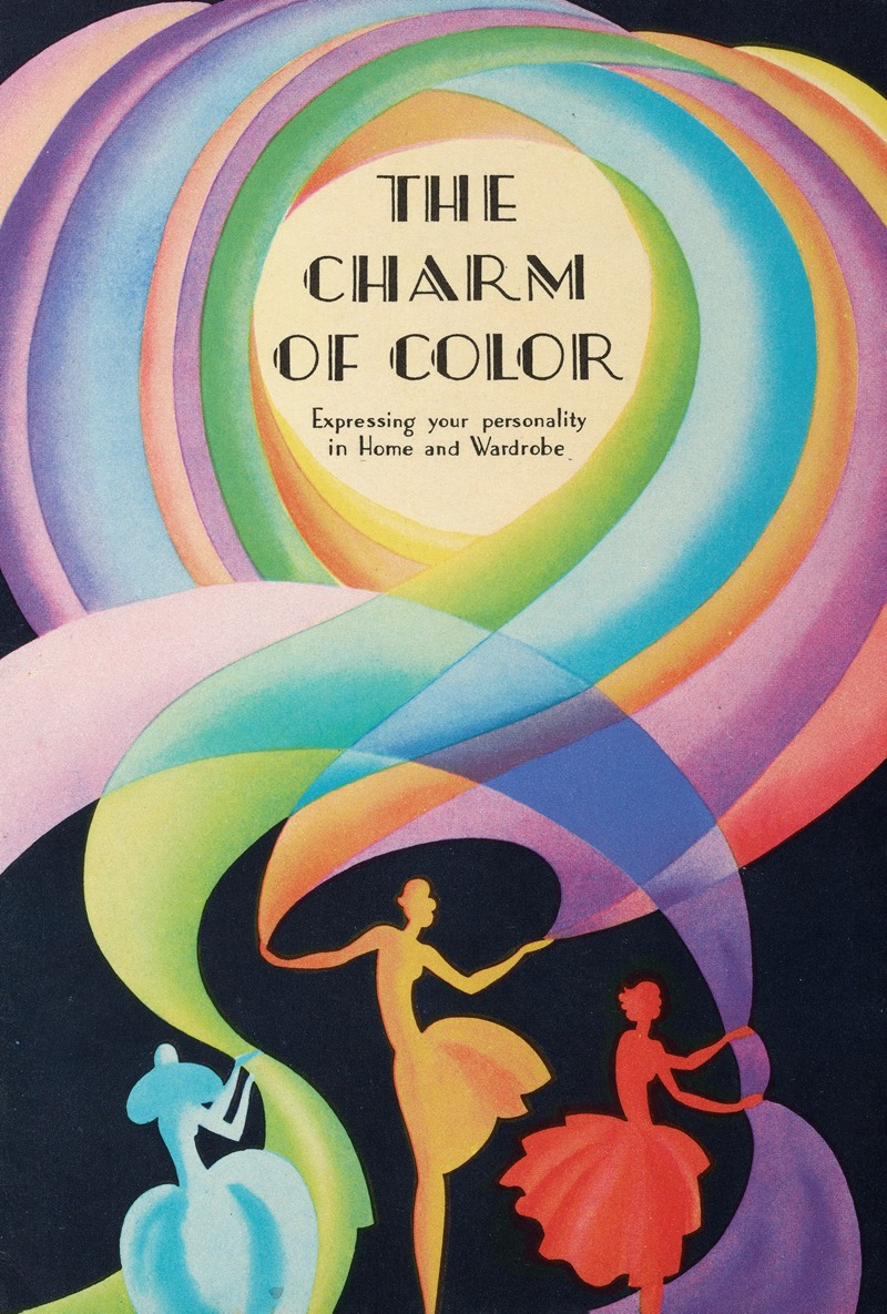
Color Theory in Fashion Design
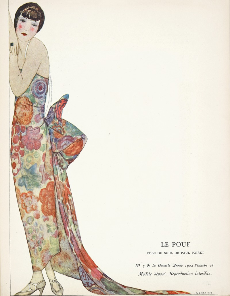
In fashion design, color plays a pivotal role in defining trends and collections. Designers and brands often look to color forecasting—a process that predicts color trends in the fashion industry—to stay ahead of the curve.
These forecasts are influenced by a variety of factors—including cultural shifts, socio-economic trends, and even technological advancements. For instance, a growing emphasis on sustainability might inspire a palette drawn from natural, earthy tones. Fashion designers integrate these forecasts into their collections—using color to encapsulate the zeitgeist and appeal to contemporary tastes.
Fabric Types and Color Behavior
Different fabrics exhibit unique behaviors when dyed, affecting the final appearance of colors. Natural fibers like cotton, silk, and wool tend to display colors with more depth and richness compared to synthetic fibers like polyester.
Additionally, the texture and weave of the fabric can influence how color is perceived. For instance, a smooth silk will reflect light differently than a coarse tweed—impacting the intensity and quality of the color. Understanding these nuances is crucial for fashion designers in selecting the right fabric to achieve the desired color effect in their designs.
Color’s Role in Style and Body Type Considerations
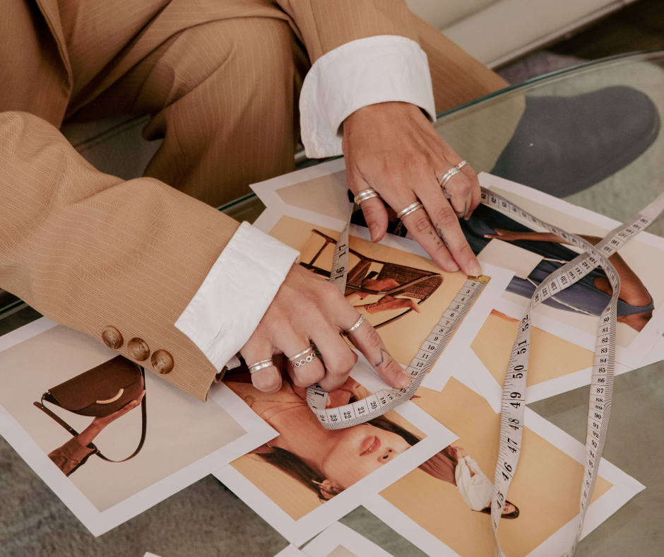
Color theory in fashion design extends beyond aesthetic appeal to consider practical aspects like style and body type. Designers use color strategically to create optical illusions. Darker colors can have a slimming effect, while bright or light colors can draw attention to certain areas.
The placement of different colors on garments can alter the perception of body proportions. Additionally, the choice of colors can complement or contrast with a wearer’s skin tone, eye color, and hair color—affecting the overall style and impact of the outfit.
By skillfully applying color theory, fashion designers can create garments that are not only visually striking but also flattering and harmonious with the wearer’s personal attributes.
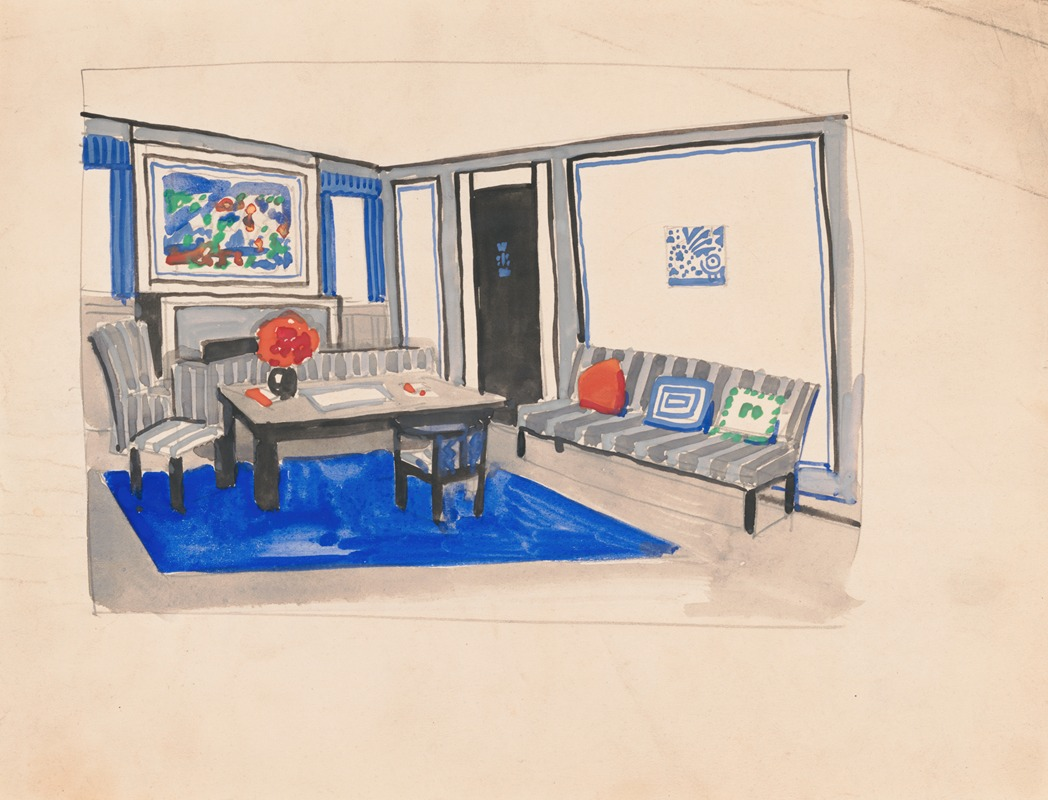
Color Theory in Interior Design
Creating Mood and Atmosphere
In interior design, color is a vital tool for setting the mood and atmosphere of a space. Warm colors like reds, oranges, and yellows can create an environment that feels cozy and vibrant—suitable for social spaces like living rooms.
On the other hand, cool colors such as blues and greens tend to evoke calmness and serenity—making them ideal for bedrooms or study areas. The choice of color palette can transform the emotional impact of a room—influencing how the space is perceived and experienced by its occupants.
Perception of Space Through Color
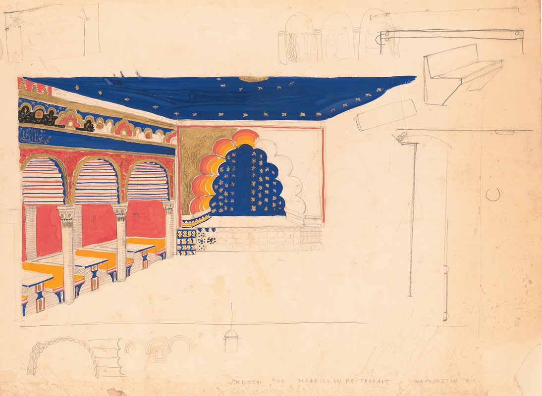
Winold Reiss (American, 1886-1953)
Color can significantly alter the perception of space in interior design. Lighter colors are known to make a room appear larger and more open, whereas darker hues can give a space a more intimate and enclosed feel.
Strategic use of color can address spatial challenges. For instance, painting a ceiling a lighter color can give the illusion of height, and a feature wall in a bold color can create a sense of depth in a small room. Understanding these visual tricks allows interior designers to manipulate space effectively—enhancing both its functionality and aesthetic appeal.
Functional Use of Color
Color in Different Types of Spaces (e.g., Residential, Commercial)
Winold Reiss (American, 1886-1953)
The application of color in interior design varies greatly depending on the type of space. In residential settings, color choices are often driven by personal taste and comfort—aiming to create a welcoming and personal atmosphere.
In contrast, commercial spaces like offices, restaurants, or stores may use color to reinforce brand identity or to elicit specific customer responses. For instance, a restaurant might use vibrant and appetizing colors to stimulate appetite, while an office might opt for muted, neutral tones to promote focus and professionalism.
Interaction with Light and Materials
The interaction between color, light, and materials is a critical consideration in interior design. Natural and artificial lighting can dramatically change how a color appears in a space, with the same color looking different at various times of the day or under different lighting conditions.
Similarly, the texture and finish of materials—whether glossy, matte, or textured—can affect color perception. Designers must consider these factors to ensure that colors behave as intended in the context of the space and its various elements.
Trends and Innovations in Colorful Interior Design
The world of interior design is continually evolving, with new color trends and innovations emerging regularly. Recent trends have seen a shift towards more sustainable and nature-inspired color palettes—reflecting a growing environmental consciousness.
There’s also a rising interest in bold and expressive colors—challenging traditional norms and allowing for more personalized and eclectic interiors. Other trends include creating a monochromatic color scheme and using bold hues like yellow-green, yellow-orange, bright pink, red-orange, and more.
Technological advancements—such as color-changing smart lighting and innovative paint formulations—are opening new avenues for creative and dynamic use of color in interior spaces. These trends not only reflect current tastes but also signify the ever-changing relationship between color and interior design.
Comparative Analysis and Cross-Disciplinary Insights
Despite the distinct applications of color theory in various fields, there are fundamental commonalities that underline its universal significance. The basic principles of the color wheel, color harmonies, and the psychological impact of color are consistent across disciplines.
Whether in painting, graphic design, fashion, or interior design, the understanding of primary, secondary, and tertiary colors, along with the relationships between complementary and analogous colors, forms the foundation of color usage. Additionally, the emotional and psychological effects of colors—such as the calming effect of blue or the energizing influence of red—are recognized and utilized in all visual arts.
These shared principles reflect the overarching role of color theory as a critical tool for visual expression and communication.
Unique Challenges and Approaches in Each Field
While the core elements of color theory remain constant, each discipline faces unique challenges and adopts specific approaches in its application. For instance, in graphic design, the transition between digital (RGB) and print (CMYK) mediums presents a significant challenge in color consistency—a concern less pertinent in painting.
In fashion design, the interplay of color with fabric types and body shapes adds complexity to color selection. Interior designers must consider the interplay of color with space, light, and material textures, while photographers deal with the impact of natural and artificial lighting on color perception.
These unique challenges necessitate tailored approaches within each field—highlighting the versatility and adaptability of color theory in different creative contexts.
Interdisciplinary Inspiration and Collaboration
Cross-disciplinary exploration of color theory not only broadens the understanding and application of color but also fosters innovation and inspiration. For example, the bold use of color in contemporary art can inspire graphic designers to experiment with unconventional color palettes in digital media.
Similarly, the dynamic color transitions in photography can influence color blending techniques in painting. The fashion industry’s trend forecasting can offer insights into emerging color preferences—influencing color choices in interior design and branding.
This interdisciplinary exchange encourages a more holistic and enriched approach to color, where insights from one field can lead to groundbreaking applications in another. The collaborative and integrative nature of color theory thus acts as a bridge—connecting various artistic disciplines in a shared dialogue of visual creativity.
Final Thoughts on Colour Theory for Artists of Various Disciplines
While the basic principles of color theory remain consistent across these fields, the unique challenges and applications in each demonstrate the theory’s dynamic and adaptable nature. The evolving trends in color usage reflect not only changes in societal and cultural preferences but also advancements in technology and materials.
This continuous evolution invites artists and designers to engage in perpetual learning and experimentation with color. By embracing the multifaceted aspects of color theory, creative entrepreneurs can unlock new potentials in their work—leading to innovative and impactful art and design that resonate with audiences across different contexts and eras.
How do you use your own colour wheel as a visual artist? Which color combinations are your favorite?
Related Posts
What is a Horticulturist, and How Do I Become One?
Let's explore the required education, many specializations, and potent

Selling in the Sunshine State: Get Your Florida Real Estate License!
Ready to apply for a Florida real estate license? From background chec
Interior Design of the 20th Century: How Dorothy Draper Made History
With a stylistic approach that was intensely anti-minimalist, Dorothy


Interior Design Trend: The Round Table is Back and Better Than Ever
Why are round tables making a comeback in interiors? Their circular fo

The Future of Real Estate: 17 Tech Trends Changing the Industry
Let's explore 17 real estate tech trends transforming the industry in