Why Creatives Should Consider an Online Color Theory Class
Summary
Reflection Questions
Journal Prompt
Color theory is foundational for artists, designers, and other creative professionals—offering insights into the science and emotion of color combinations we select for interiors, advertisements, paintings, and so much more. Understanding color theory allows us to blend technical knowledge with intuitive feeling to create compelling compositions and convey powerful messages. From the historical teachings of Itten and Albers to the contemporary applications in digital and physical mediums, color theory ensures we craft harmonious, impactful designs that evoke the desired emotions. Read on to learn more about this discipline and for a short list of our favorite online color theory classes to get you started.
What is Color Theory?

Color theory is a set of principles used to create harmonious color combinations and visual effects with colors. It encompasses the color wheel, color harmony, and the context in which colors are used, providing a framework for understanding how different colors interact with each other and the effects they produce in combination. Color theory goes far beyond primary colors vs tertiary colors and warm colors vs cool colors on color wheels. It has many applications outside of acrylic painting or graphic design, which is why different professionals should consider taking a course (or at least a lesson here and there).
Central to color theory are the concepts of hues (the pure colors on the color wheel), saturation (the intensity or purity of a color), and value (the lightness or darkness of a color). Artists and designers will also learn about the concepts of shade and tint when dipping their toes into the world of color theory. These principles guide artists, designers, and even marketers in choosing color palettes that are aesthetically pleasing or serve a particular communicative purpose. Color theory is essentially about the relationships between colors and the technical aspects of combining colors in design and art. Of course, texture, pattern, and shape also come into play.
What’s the Difference Between Color Theory and Psychology?

Color psychology, on the other hand, dives into the depth of emotional and psychological effects colors have on people. It explores how colors can influence perceptions and behaviors, suggesting that different colors can evoke different feelings, moods, and associations. For example, blue is often associated with calmness and trustworthiness, while red may evoke feelings of passion or urgency.
Color psychology is widely utilized in branding, marketing, and interior design to elicit specific responses from an audience or create a particular atmosphere. While color theory provides the foundational knowledge of how to mix and match colors, color psychology offers insight into the emotional and psychological impact of those color choices.
Examining Different Schools of Thought Within Color Theory
Within color theory, there are several schools of thought that have evolved over time, reflecting different approaches and understandings of how color operates. One notable example is the Itten Theory, based on the work of Johannes Itten, a Swiss color theorist and artist. Itten’s theory is foundational in art and design education, emphasizing color contrasts and harmony, and introducing the concept of subjective feelings and objective color principles.
Another influential school of thought comes from the work of Josef Albers, who focused on the interaction of colors, demonstrating how our perception of a color is affected by its surrounding colors. Albers’ experiments highlighted the relativity of color, showing that a single color can appear differently depending on its context.
Lastly, the Bauhaus movement, where both Itten and Albers taught, integrated color theory into its curriculum, promoting a multidisciplinary approach that combined science, art, and technology. The Bauhaus philosophy contributed significantly to modern design and art education, emphasizing functionalism and the psychological effects of color and form. These various schools of thought have shaped contemporary understanding of color, illustrating its complexity and the myriad ways it can be approached and understood in creative disciplines.
Learn more about how different artistic disciplines use color theory in their practices here.
How Does Understanding Color Theory Benefit Artists and Designers?
Understanding Color Relationships

Understanding the relationships between colors is foundational in creating compositions that are visually appealing and harmonious. Color theory classes introduce the color wheel—a fundamental tool for understanding these relationships. It delineates how colors interact with each other, highlighting complementary (colors opposite each other on the wheel), analogous (colors next to each other on the wheel), and triadic (three colors evenly spaced on the wheel) schemes. These relationships guide the selection of color palettes that can balance or contrast with each other in a way that is aesthetically pleasing. This knowledge is crucial not just for artists but for anyone involved in creating visual content, as it affects the overall impact and readability of the design.
Moreover, mastering color relationships enables creatives to manipulate spatial perceptions and hierarchies within their work. For example, complementary colors can create a vibrant look when placed next to each other, while analogous colors offer a more harmonious and serene composition. Understanding these dynamics can significantly enhance the effectiveness of a design, allowing creatives to direct viewer attention, evoke specific moods, and reinforce the visual narrative of the work. This level of control is essential in professional design work, where the strategic use of color can differentiate a product, communicate a brand’s values, or make a piece of art more engaging.
Enhancing Emotional Impact

Colors have a profound ability to evoke emotions and influence perceptions, making the study of color psychology an essential aspect of color theory classes. Different colors can stimulate various emotional responses: blues can evoke calmness and trust, reds can convey energy and urgency, while yellows might represent happiness and creativity. By understanding these associations, creatives can strategically use color to evoke specific feelings in their audience. This understanding is pivotal in advertising, branding, and art, where the emotional impact can significantly affect viewer engagement and response.
Beyond immediate emotional reactions, color can also influence behavior and decision-making. For instance, color choices in a call-to-action button can affect conversion rates on a website, or the palette of a painting can affect its interpretive context. Through color theory, creatives learn not just to select colors that match aesthetically but also to craft experiences that guide the viewer’s emotional journey. This skill is particularly valuable in fields like marketing and user experience design, where emotional resonance can be as crucial as functional design.
Improving Visual Communication
Color is a potent tool in conveying messages and enhancing the clarity of communication. Through color theory classes, creatives learn to use color effectively to support and reinforce their message. This knowledge is vital across various applications, from branding and marketing to fine art. For example, selecting the right colors can make a brand identity more memorable, improve the usability and user experience of a website, or convey the mood and atmosphere of a painting. Understanding how different colors and their combinations can affect interpretation helps creatives to communicate more clearly and effectively.
Moreover, color can be used to create hierarchy, direct attention, and guide the viewer through a visual experience. By manipulating color contrast, saturation, and brightness, designers can emphasize important elements, denote interactivity in digital interfaces, or create focal points in visual compositions. This ability to guide the viewer’s eye and underscore key information is crucial in effective visual communication, making the study of color theory indispensable for anyone involved in the visual design and communication fields.
Increasing Design Cohesiveness

A deep understanding of color theory aids creatives in developing cohesive color palettes that unify various elements of a design. Cohesiveness is essential for branding, where consistent use of color strengthens brand recognition, or in product design and interior design, where it contributes to a harmonious aesthetic. Color theory classes teach how to select and combine colors based on their relationships on the color wheel, their cultural and contextual significance, and their psychological impact. This process ensures that all parts of a design work together visually, reinforcing the overall concept and enhancing the user or viewer’s experience.
Consistency in color usage across different mediums and platforms is also crucial for maintaining brand identity and message clarity. For example, the colors used in a company’s logo should be echoed in its website design, marketing materials, and products to create a seamless brand experience. This consistency helps in building a strong, recognizable brand identity. Learning about color harmony, balance, and contrast enables designers to create aesthetically pleasing and effective designs that communicate a brand’s values and appeal to its target audience.
Facilitating Problem Solving
Color theory provides a structured approach to addressing design challenges, offering creative and theory-based solutions. When designers encounter visual problems, such as a lack of emphasis, poor user engagement, or an imbalanced composition, a solid understanding of color can guide them towards effective solutions. For instance, adjusting the color scheme of a design can alter its mood, improve readability, or correct visual imbalance. This problem-solving aspect of color theory is essential in all stages of the design process, from conceptualization to execution, allowing for iterative improvements that enhance the final product.
Moreover, color theory equips creatives with the ability to reason and justify their design decisions. This capability is invaluable when collaborating with clients or team members, as it allows designers to articulate the rationale behind their color choices. This can lead to more productive discussions, clearer design objectives, and ultimately, more successful projects. By understanding the principles behind color usage, designers can navigate complex design challenges with confidence and creativity, leading to innovative and effective design solutions.
Expanding Creativity
Understanding the fundamentals of color theory expands a creative’s palette in both a literal and metaphorical sense. With a comprehensive understanding of how colors interact and the emotions they evoke, creatives are empowered to experiment beyond intuitive color choices. This exploration can lead to the development of unique color palettes that distinguish their work. Color theory encourages artists and designers to think critically about color use, pushing the boundaries of traditional color schemes to create something truly innovative. This process is essential for personal and professional growth, leading to the discovery of new styles and the refinement of artistic voice.
Furthermore, the study of color theory can inspire creatives to explore unexpected color combinations and to use color in ways that challenge conventional perceptions. This exploratory approach can lead to breakthroughs in design and art, where color becomes a primary vehicle for expressing ideas and evoking responses. By deepening their understanding of color, creatives can transform their work, making it more engaging, expressive, and impactful. This continuous exploration and learning process is crucial for staying relevant and innovative in the fast-paced creative industries.
Adapting to Different Mediums

Color behaves differently across various mediums and materials, an aspect thoroughly explored in color theory classes. Digital displays, print materials, and physical materials such as fabric or paint all interact with color uniquely, affecting how colors are perceived. Understanding these differences is crucial for creatives working across different mediums, ensuring that their color choices translate effectively from concept to final product. For instance, a color that looks vibrant on a computer screen may appear muted in print, necessitating adjustments to maintain the intended impact. Color theory classes provide the knowledge needed to navigate these challenges, equipping creatives with the skills to make informed color choices regardless of the medium.
Additionally, this adaptability is increasingly important in a cross-disciplinary environment, where projects may span digital and physical realms. A graphic designer creating branding materials, for example, must understand how colors will look on digital platforms, printed collateral, and merchandise to ensure consistency and coherence. By learning about color management and the properties of different materials and displays, creatives can more effectively control the outcome of their work, ensuring that their vision is accurately realized in all contexts. This level of proficiency is essential for professional success in fields that demand versatility and precision in color usage.
Enhancing Professional Competency
In many creative fields, a solid grasp of color theory is a mark of professional competency. It signals a designer’s or artist’s ability to make informed, intentional choices about color, contributing to the effectiveness and aesthetic quality of their work. Color theory classes lay the foundation for this competency, covering not just the basics of color mixing and matching but also the strategic use of color in communication and branding. This knowledge is essential for creating work that not only looks good but also fulfills its intended function, whether it’s to sell a product, convey a brand’s identity, or communicate a specific message.
Being proficient in color theory also enhances a creative’s ability to collaborate and communicate with others in their field. It enables designers and artists to articulate their ideas more clearly, justify their choices, and critique the work of others constructively. This skill is invaluable in team settings, client presentations, and educational environments, where clear communication about design choices can lead to better outcomes and more successful collaborations. Professional competency in color theory is not just about making beautiful things; it’s about understanding and leveraging color’s power to achieve specific goals.
Cross-disciplinary Relevance

Color theory’s applicability extends beyond traditional art and design disciplines, touching on digital media, fashion, advertising, architecture, and more. This wide-ranging relevance underscores the importance of color knowledge across various creative and professional fields. For instance, in digital media, understanding color can enhance user experience and accessibility, while in fashion, it can dictate trends and consumer preferences. In advertising, color plays a crucial role in brand recognition and emotional appeal, and in architecture, it can influence the perception of space and form. Color theory classes equip individuals with a versatile skill set that applies to multiple contexts, enhancing their ability to contribute creatively and effectively in their chosen fields.
Moreover, the cross-disciplinary nature of color theory encourages a holistic understanding of design and creativity, fostering interdisciplinary collaboration and innovation. By understanding the principles of color theory, professionals can work more effectively across different domains, integrating color knowledge into diverse projects. This integration can lead to more cohesive and innovative solutions, whether in creating a brand identity that spans print and digital media or designing public spaces that consider the psychological impact of color. The universal language of color thus becomes a powerful tool for collaboration, bridging gaps between disciplines and enhancing the overall quality of creative work.
Cultivating Aesthetic Sensitivity
Studying color theory over time refines an individual’s sensitivity to color nuances, leading to a more sophisticated understanding and use of color in creative work. This sensitivity allows creatives to perceive and appreciate subtle differences in hue, saturation, and brightness, which can significantly affect the emotional and aesthetic impact of a design or artwork. Aesthetic sensitivity to color is developed through continuous exposure, analysis, and application of color theory principles, enabling creatives to make more nuanced and impactful color choices. This refined sensitivity is particularly important in fields where visual distinction and appeal are paramount, such as fine arts, fashion design, and branding.
Furthermore, cultivating an aesthetic sensitivity to color enhances a creative’s ability to innovate and experiment with color in ways that challenge conventional perceptions and engage audiences. It enables artists and designers to use color not just as a functional tool but as a means of expression and exploration. This exploration can lead to a distinctive personal style or groundbreaking design solutions that set new trends and push the boundaries of traditional aesthetics. As creatives continue to engage with and learn from color theory, their evolving sensitivity to color becomes a vital asset in the creation of visually compelling and emotionally resonant work, underscoring the ongoing importance of color theory in creative education and practice.
Online Color Theory Classes for Artists and Designers
Taking a color theory class in person can be more impactful for certain creative professionals, but an online class can offer basic foundational education. For artists and designers looking to deepen their understanding of color theory through online courses, there are several highly regarded options available that cater to different aspects of color application, theory, and psychology. Let’s take a look.
Color Theory: Exploration & Application by Richard Mehl on Domestika
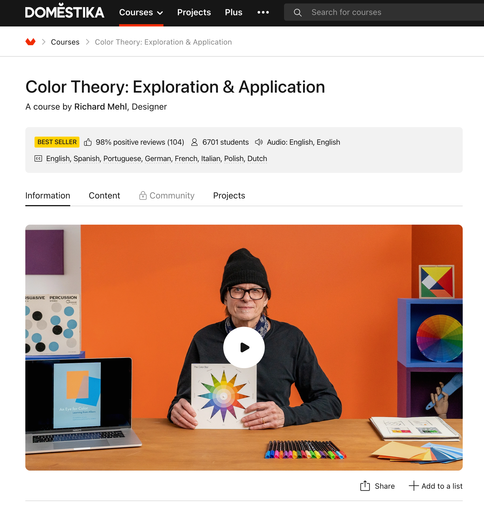
This course focuses on applying color theory in graphic design and explores the principles developed by renowned artists like Johannes Itten and Josef Albers. This course is led by Richard Mehl, an experienced designer and educator who brings a comprehensive approach to teaching color theory, incorporating both practice and theory, including poster design, type styles, composition, and animation.
Color Theory from the University of Colorado Boulder
Featured on a list of best color theory courses, this course covers design elements, uses of color, and graphic file formats. It starts with the basics of the color wheel and progresses to how colors are used in various mediums, including print and electronic media. By the end of the course, students will understand how to select between CMYK, Pantone, and RGB color options, and will have a chance to design a web or sponsorship advertisement.
CreativeLive’s “Illusion of Transparency from Color Theory for Designers: Exploration and Application”
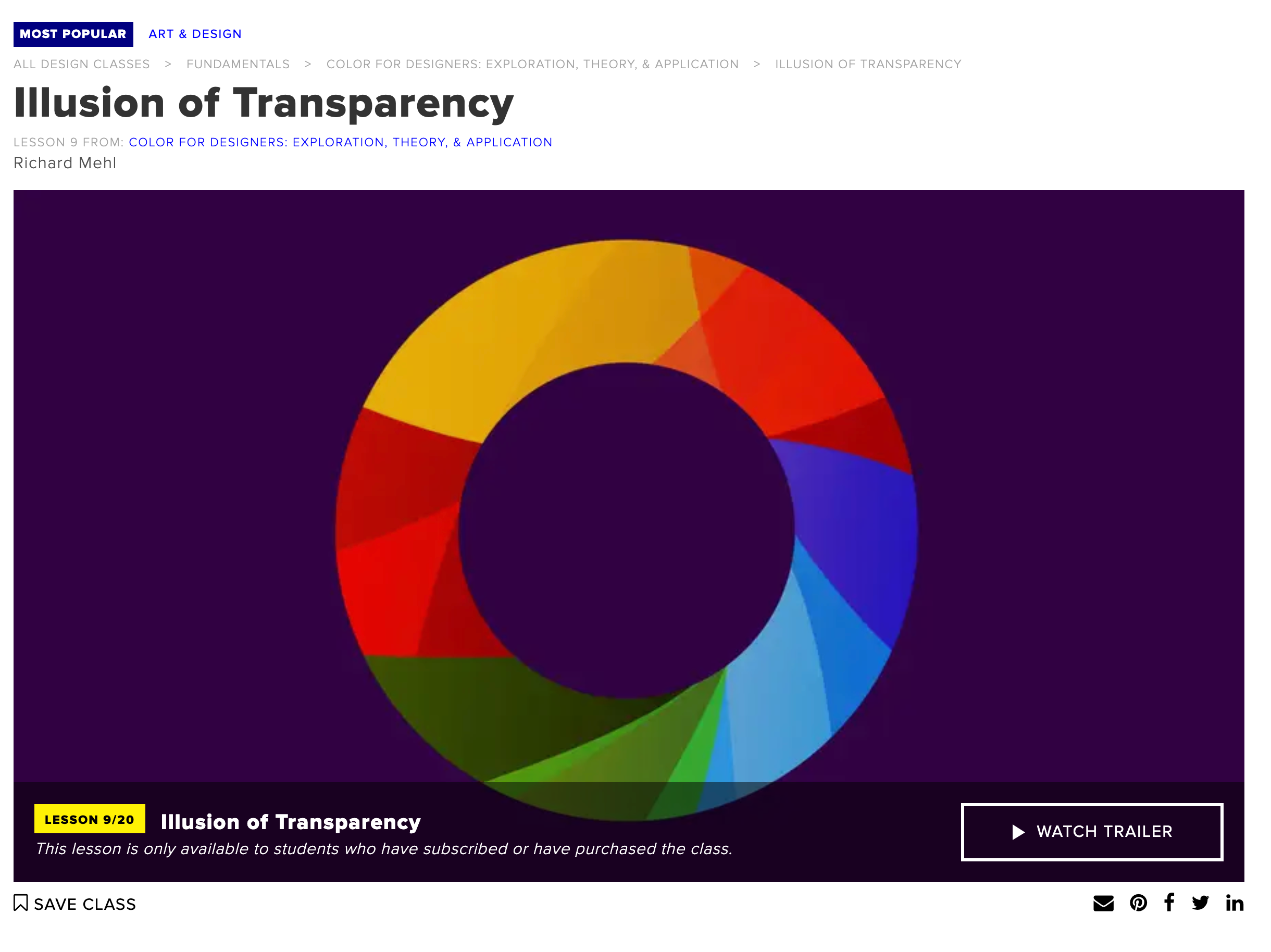
This course includes a series of hands-on lessons that dive deep into how colors interact with each other to create illusions of transparency, a concept pioneered by Josef Albers. This course encourages practical experimentation, providing a deeper understanding of color relationships and how they can be applied to design.
Leatrice Eiseman’s Online Color Training Courses
These classes offer in-depth training in color theory, including self-check quizzes and interactive Q&A sessions with Eiseman herself. Courses cover various topics, including the Color and Design Master Course and Colortime® Image Online Training, focusing on practical applications of color theory in fields like wedding services and interior design. Eiseman’s courses are renowned for their comprehensive approach to color theory, combining psychological insights with practical applications.
Let us know if you take one of these courses in the comments below!
Related Posts

Work-Life IntegrationIntegration Tips for CreativeCreative Entrepreneurs
From involving your kids to rethinking your office's layout, here are


Sustainable Interior Design: Celebrating Eco-Conscious Designers
Prioritizing human health, the natural world, and careful allocation o

From Paris to New York: These Are the Most Stunning Art Deco Apartments in the World
From the iconic skyscrapers of New York City to the beachfront beautie

The CEO’s Listening List: Best Business Podcasts For Women
From Women at Work by Harvard Business Review to The Unmistakable Crea

Back in Vogue: These Vintage Interior Design Styles Are Everywhere
From Brutalism and Art Deco to Mid-Century Modernism and Swedish Folk,